What non-illuminated letters are used for
Non-illuminated letters are individual fabricated characters fixed directly to a wall, cladding, fascia or backing panel. They are chosen where the branding must read clearly in daylight, but there is no need for internal glow, halo lighting or electrical wiring at the face of the sign.
For corporate buildings in Sandton, logistics sites in Germiston, retail parks in Midrand and municipal buildings in Pretoria, this format gives a tidy result with less maintenance than lit signage. It works well on concrete, aluminium composite panels, stone, precast walls and painted renders, provided the fixing method is matched to the substrate.
The finish can be plain or polished, painted to match your brand colours, or metal-faced for a more formal look. If the site is coastal or exposed to heavy dust, we will usually suggest a powder-coated or stainless fixing detail so the letters keep their shape and colour for longer.
Sizes, depth and material options
Letter height is normally set by viewing distance and wall space. Small lobby signs can start at 150 mm high, while building fascias often sit between 300 mm and 1200 mm high per letter, depending on the logo and elevation. For roadside visibility, the exact size should be checked against approach speed and angle, especially on busy corridors in Gauteng.
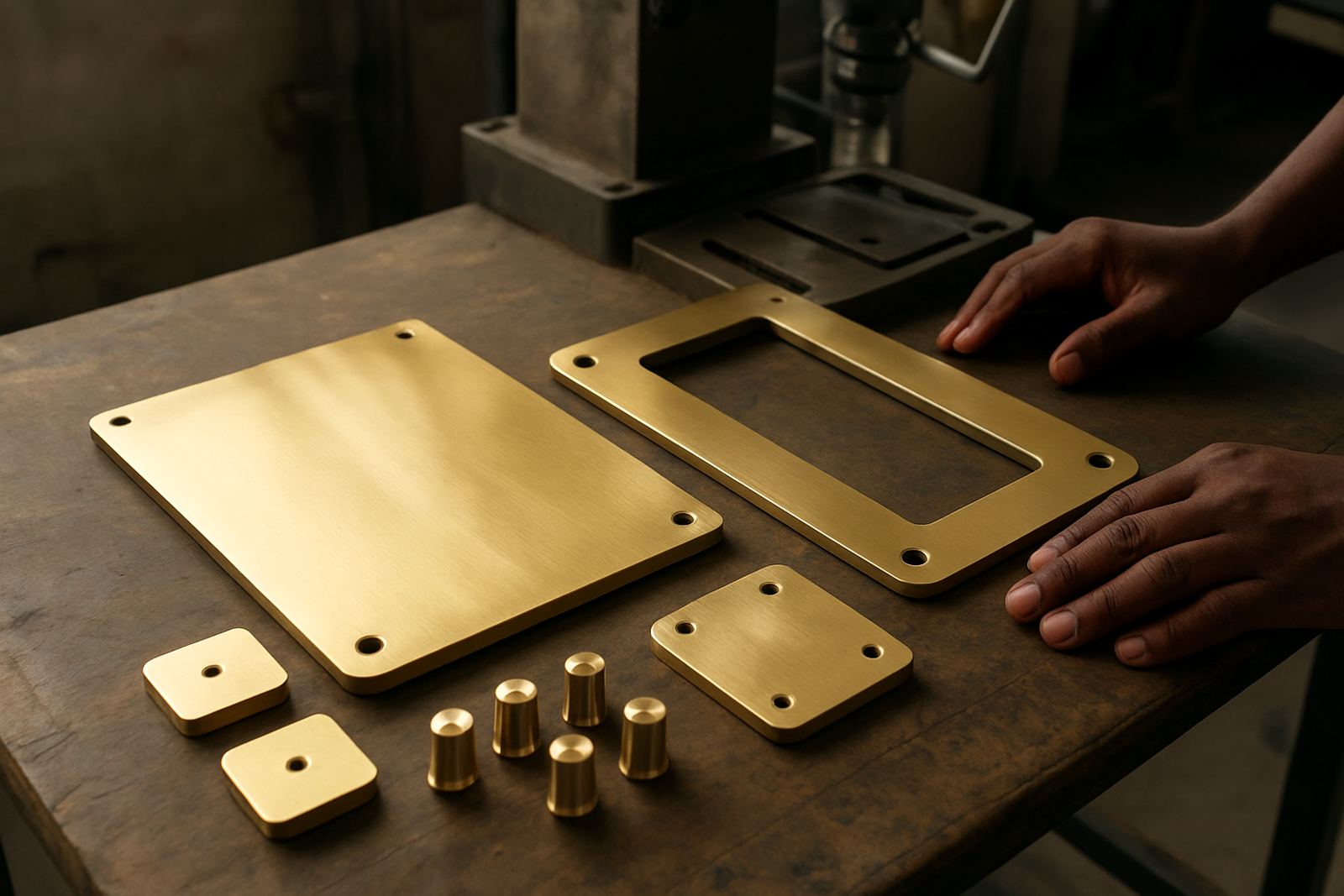
Typical material options include brushed or polished aluminium, stainless steel, brass, Perspex, and powder-coated mild steel where the profile and coating are suitable. Depth can range from shallow face-cut letters of around 20 mm to built-up returns of 50 mm, 75 mm or more. Thicker letters cast stronger shadows and feel more substantial on large façades.
- Face style: flat cut, built-up, folded or routered
- Finish: brushed, polished, painted, powder-coated or wrapped
- Mounting: direct fix, stand-off pins, hidden rails or template-based fixings
- Use case: reception walls, entrance façades, courtyards, boundary walls and retail fronts
Where a lighter solution is needed, we may recommend Perspex or aluminium composite rather than solid metal. Where the building calls for a more permanent presence, stainless steel or brass gives a better long-term look, especially in public-facing developments.
Where this product suits best
These letters suit architecture where the building itself should carry the identity. They work well on corporate headquarters, sectional-title entrances, schools, clinics, warehousing offices, hotels and municipal facilities. In places with strict aesthetics, such as new developments and sectional title sites, non-illuminated letters often pass approval more easily than lit signs.
They are also useful when power is limited or when the sign sits in a position where running electrics would add cost and complications. That includes heritage façades, boundary walls, temporary leasing spaces and areas where load-shedding or restricted access makes lit signage less practical. With no transformers or LED modules required, the sign remains simple to service.
For outdoor use near the coast or in high-dust industrial zones, we pay close attention to corrosion resistance, fastener choice and the gap between the letters and the wall. A poor fixing detail can stain a façade or loosen over time, so the installation spec matters as much as the visual design.
Installation, fixings and site requirements
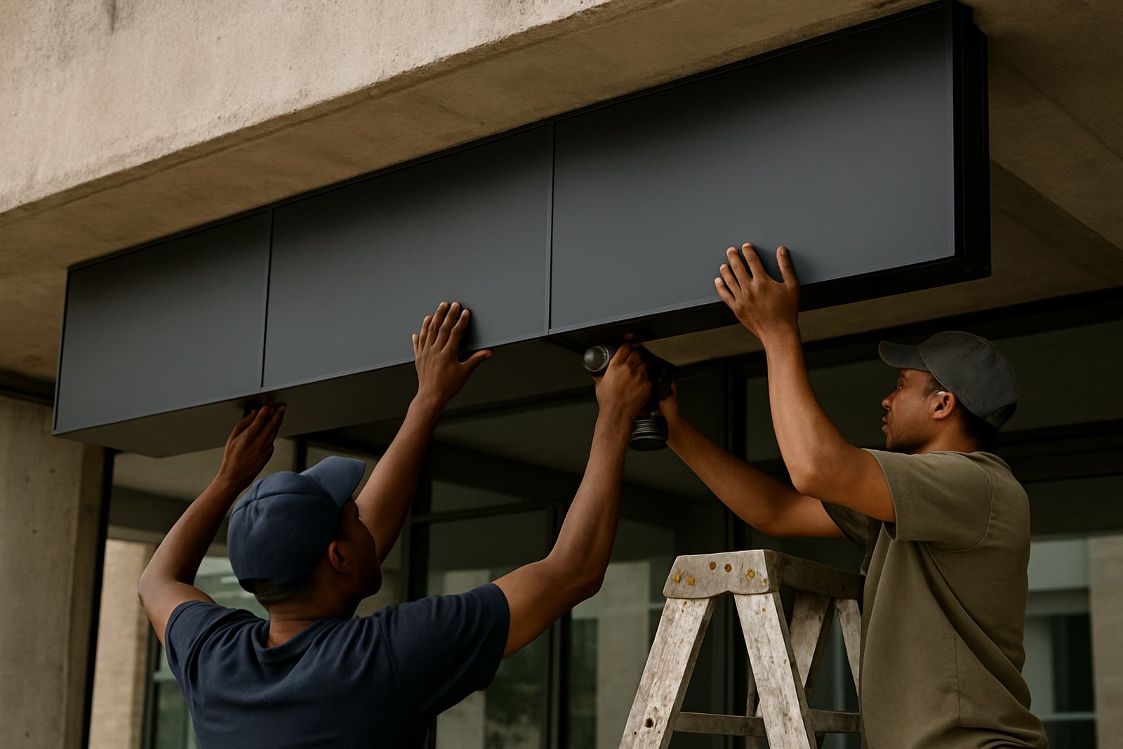
Installation starts with a site survey and a measured template. We confirm the substrate, assess wall flatness, check for movement joints, and identify any waterproofing membranes or service routes behind the surface. That step is important on cladding and precast walls where a careless fixing can create long-term problems.
Most non-illuminated letters are installed using threaded studs, hidden brackets or stand-off mounts. On heavier metal letters, the engineer or project team may need to confirm wind load and fixing pull-out strength. For larger façades, access equipment, scaffold or a rope-access plan may be needed, particularly on multi-storey buildings and long boundary walls.
- Allow for safe access at the full installation height
- Confirm whether the wall is brick, concrete, cladding or render
- Check if the area needs after-hours work or traffic control
- Confirm whether drilling is permitted on the façade
- Plan for sealant, corrosion protection and tidy cable-free finishing
Because there is no power requirement for the letters themselves, you do not need to budget for electrical connections, drivers or controllers. That keeps the sign simpler, although any adjacent lighting such as wall washers or entrance lights should still be planned with the building team.
Care, cleaning and servicing over time
Non-illuminated letters are low maintenance, but they still need sensible care. Dust, pollution and coastal salt can dull metal finishes, while high pressure washing done too close to the face may lift paint edges or force water behind the fixing points. A soft cloth, mild detergent and clean water are usually enough for routine cleaning.
For brass and polished finishes, a scheduled clean helps keep the surface even. Powder-coated and painted letters should be checked for chips, fading and movement after strong winds or building work nearby. If one letter is damaged, it is usually possible to replace that section rather than the full sign.
We recommend that larger sites include signage in their maintenance planning, especially where access is difficult. A quick annual inspection can pick up loose fixings, wall cracks, sealant failure and staining before those issues become visible to visitors or tenants.
Details to verify before ordering acrylic face signs
Before production starts, we need accurate artwork, the full wording, the exact letter heights and the final site position. It also helps to know whether the letters are for indoors or outdoors, the wall finish, and whether the branding must match an existing corporate standard. Small changes in spacing or depth can alter the final look quite a lot.
Please also confirm the following:
- Exact wording, font or logo artwork, and any spacing rules
- Overall sign width and the maximum height available on site
- Preferred material and finish, including colour references
- Indoor or outdoor use, plus any exposure to sun, rain or coastal air
- Mounting surface and whether drilling is allowed
- Required installation date and whether access is restricted
If you are unsure about size or finish, a site survey and layout proposal will usually settle it. That is often the best way to avoid a sign that is too small for the wall or too busy for the architecture.
How Deep3 handles the project
Deep3 Signage Consultants manages the full process from specification through to installation. Our team includes Sibusiso Mthembu, Leanne van Wyk, Sakhile Motsepe, Thandiwe Ndlovu, Riaan Smit and Omolemo Msiza, and we work from Modderfontein with projects across Gauteng and further afield. That includes design development, material choice, approval support, fabrication and site rigging where required.
For non-illuminated letters, our focus is simple: the sign must read clearly, sit level, and suit the building. Whether the brief is for a developer, municipality or private brand, we make sure the fixing method, finish and proportions are proper for the site. In practice that means fewer call-backs and a neater result.
We also handle maintenance planning and project handover where a site needs ongoing support after installation. If the letters are part of a larger signage rollout, we can coordinate them with directory boards, pylons, road signs or other external branding on the same property.
Key facts
| Product type | Non-illuminated fabricated letters |
|---|---|
| Typical letter height | 150 mm to 1200 mm+ depending on viewing distance |
| Common materials | Aluminium, stainless steel, brass, Perspex, powder-coated steel |
| Mounting methods | Stud mount, hidden bracket, stand-off fix or rail system |
| Power requirement | None for the letters themselves |
| Use environments | Indoor, outdoor, corporate, retail, municipal and development sites |