Why contrast beats decoration when people have seconds to read
Most signage is seen in motion. Drivers pass a pylon in a few seconds, shoppers glance at a directory while turning a corner, and staff read safety boards while carrying tools or pushing trolleys. If the background and text are too close in value, the message disappears before the design even gets a chance. That is why clear colour contrast usually matters more than extra outlines, textures or fancy effects.
In practical terms, contrast is not only about black on white or white on navy. It is about separating foreground from background strongly enough that the human eye can pick up the message at the distance and speed involved. On a bright Highveld afternoon, a pale grey logo on a silver panel may look neat in the workshop, then wash out completely outside. A sign can be well made and still fail if the colour relationship is wrong.
- High contrast helps in sunlight, shade and night lighting.
- It supports faster reading for road users and visitors.
- It reduces mistakes on wayfinding, safety and directional signage.
How Johannesburg light changes what works on site
Johannesburg has strong sun, sharp shadows and dusty conditions for much of the year, with summer storms and winter mornings that can be misty or hazy. In areas like Modderfontein, Sandton and Midrand, a sign may sit beside reflective glass, white boundary walls or planted edges that all compete with the message. What looks balanced on a screen can become weak once it is fixed to a building or mounted above a busy entrance.
We often look at the site first, then choose the colour pairings from there. A retail centre near a road with fast traffic needs different treatment from a municipal notice board in a shaded courtyard. Coastal humidity in Durban brings its own issues too, especially where salt air can dull finishes over time. The colour choice should still read well after weathering, not only when it is newly installed.
- Test the design in daylight, not only indoors.
- Check the sign from the actual viewing distance.
- Allow for glare from glass, vehicles and metal cladding.
- Choose finishes that keep their tone after exposure, dust and rain.
Choosing colour pairs that hold up on real signage
The safest starting point is to pair a light value with a dark value. White on charcoal, yellow on deep blue, or black on pale cream are all common because they stay legible in many settings. The important point is not just the hue but the difference in brightness. Two colours can look very different in tone and still be poor together if the values are too close.
For long-copy signs, such as safety instructions or directional boards, avoid combinations that strain the eye. Red on black, blue on green, or light silver on white might look stylish in a presentation but are difficult to read in real conditions. If the sign has to be read quickly, the colour system should work hard for the message, not against it.
- Use one main background colour and one clear text colour.
- Reserve accent colours for arrows, icons or highlights only.
- Keep brand colours, but adapt them for readability where needed.
- For reflective or metallic finishes, test the contrast under natural light.
Material finish matters as much as the colour itself
A gloss panel, a brushed metal face and a matte vinyl print will all behave differently in daylight. The same colour can appear lighter or darker depending on sheen, texture and surrounding reflections. That is why material specification is part of contrast planning, not an afterthought. A well chosen colour can still fail if the surface catches too much glare.
On aluminium, brass, Perspex and fabricated lettering, the finish must suit the location. An entrance sign under direct sun may need a matte or low-sheen face to control reflection. A light box needs the right opacity so the internal illumination spreads evenly. Printed vinyl can also shift in appearance if the substrate colour shows through or if the print is too thin, so the base material has to be considered early in the process. Sometimes a small adjustment in finish makes the whole thing work better, no drama needed.
Where contrast decisions affect safety and wayfinding
Wayfinding is one of the clearest places where contrast earns its keep. A visitor should be able to tell where to park, where to sign in and where not to go without stopping the car or asking for help. The same applies to load-shedding notices, emergency exits, no-entry signs and plant safety boards. If the colours are weak, people will miss them at the exact moment they matter most.
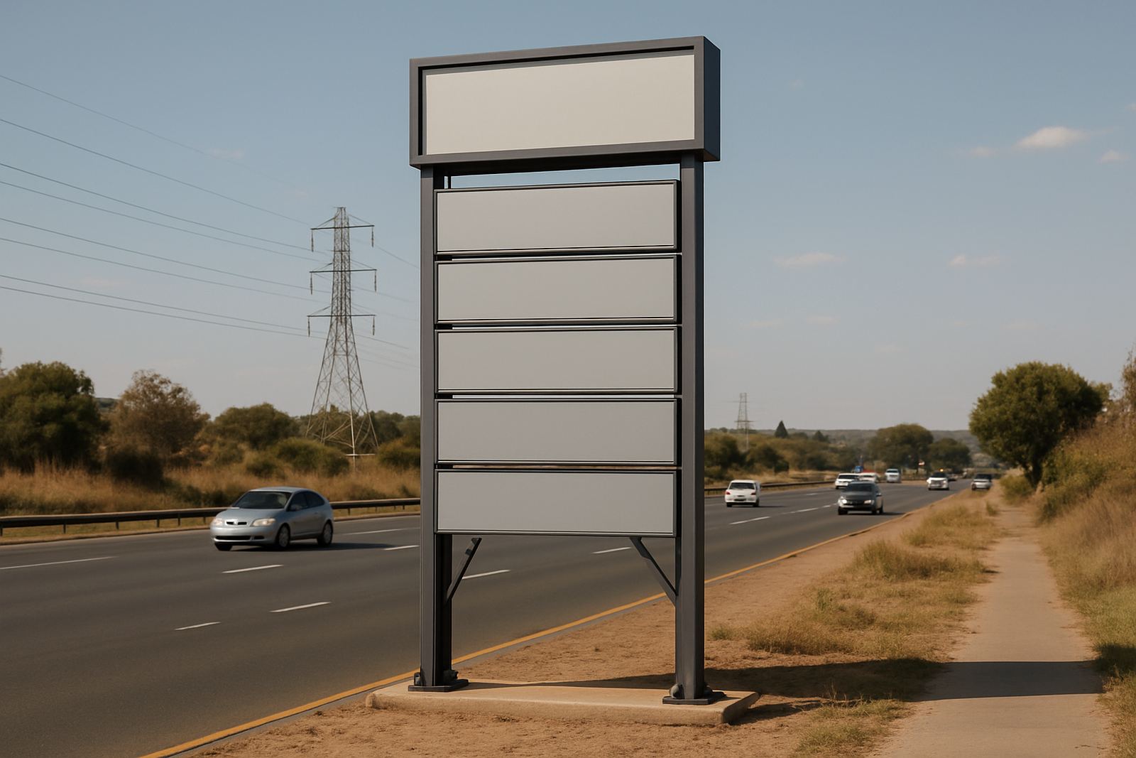
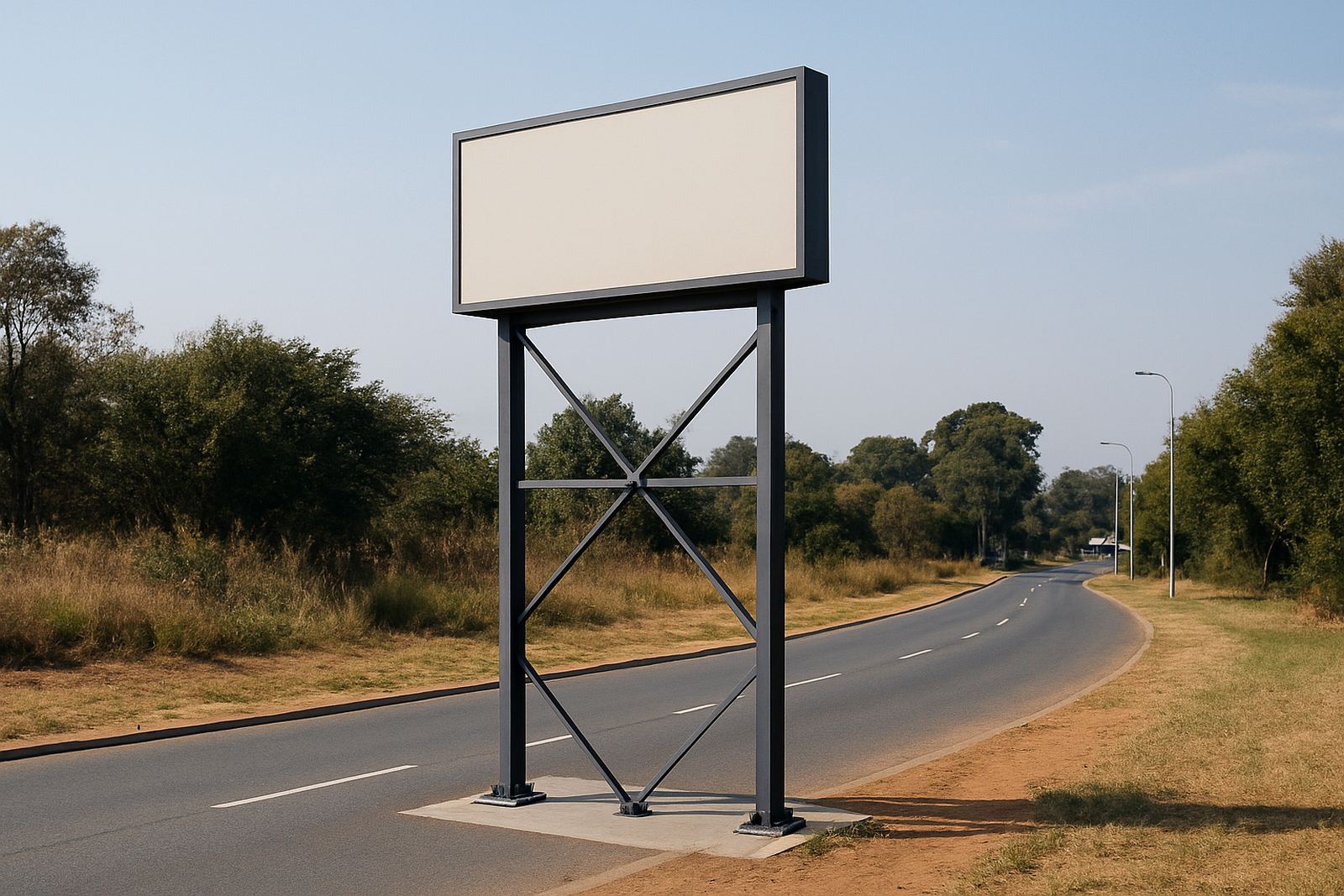
We also treat contrast carefully on larger projects such as road signs, pylons and billboards, where readability depends on distance as much as design. A pylon on a development site in Pretoria needs to be read from moving traffic, while a corridor sign in a Germiston warehouse must be legible under mixed lighting and dust. In those cases, the contrast plan should be tied to the route people actually follow.
- Use strong contrast for safety instructions and exits.
- Increase letter height before adding more decoration.
- Keep directional signs simple, with one clear action per panel.
Local example: a retail entrance that had to read from the taxi rank side
A shopping centre approach in Gauteng once needed a new entrance sign that could be read from traffic coming off the main road and from pedestrians crossing from a nearby taxi rank. The first concept used a pale brand panel with slim lettering, which looked neat in the studio but became faint in afternoon glare. The revised version used a darker background, thicker letters and a more direct spacing between the message and the logo. That small change made the sign far easier to pick up from a moving vehicle.
What helped most was not adding more colour. It was reducing the number of competing elements and giving the lettering enough contrast to do its job. The centre still kept its identity, but the sign now worked at street level. That is often the point with colour contrast: it should support the brand, not fight for attention. A readable sign is doing commercial work every day, and that matters more than a clever effect.
Planning contrast before fabrication saves time on site
Once a sign is fabricated, changed colours mean delays, extra material and approval complications. It is much better to settle contrast early, during design development and material specification, than to discover a problem after the panels are cut. That is especially true when projects involve municipal approvals, structural coordination or multi-site rollouts across Gauteng and beyond.
At Deep3 Signage Consultants, colour contrast is checked alongside viewing distance, lighting, mounting height and finish. That approach helps with everything from wayfinding to LED screen integration. When the contrast is right, the sign is easier to maintain, easier to read and less likely to need rework later. In a busy environment, that is not a small detail, its usually the difference between a sign that performs and one that just looks busy.