
Start with the user journey, not the signboard count
Wayfinding hierarchy is the order in which a person sees and uses information. If that order is wrong, the site can have plenty of signs and still feel confusing. The first job is to map the journey from the main road, gate, parking area and reception point through to the actual destination, then decide what people need at each decision point.
For a large site in Modderfontein or Sandton, that usually means separating the big decisions from the small ones. The major sign should confirm the place or zone. The secondary sign should guide traffic deeper into the site. The local directional sign should help a visitor finish the last 20 to 50 metres, where stress often starts because people are looking for a bay, door, lobby or loading point.
What major signs must do at the first decision point
Major signs are the anchors. They sit where a person first needs certainty, such as the boundary wall, entrance island, security gate or the first internal split. They should be large enough to read from the approach speed on the road or driveway, and simple enough to take in at a glance.
At this level, the message must stay clean. If a sign tries to carry every unit number, tenant logo and instruction at once, it becomes noise. The better approach is to give the site identity, the primary destination and the direction of travel. In Gauteng, where traffic moves quickly and turning space can be tight, clarity matters more than decoration.
- Use one primary message per face where possible.
- Keep contrast strong for daylight glare and evening lighting.
- Place the sign where drivers can slow safely before reading.
- Allow for security gates, curb lines and turning radii.
How secondary signs reduce hesitation inside the site
Secondary signs take over once the person is inside the boundary. Their job is to confirm direction before the visitor reaches a dead end or has to stop and ask for help. This is where arrows, zone names and parking group labels become useful.
On retail, education and industrial sites, secondary signs work best when they repeat the same wording in the same style throughout the route. A person should not have to decode different arrow shapes, different naming systems or mixed abbreviations. If the site uses Block A, Building 1 and Loading Bay 3, those names must stay consistent on every board and every map.
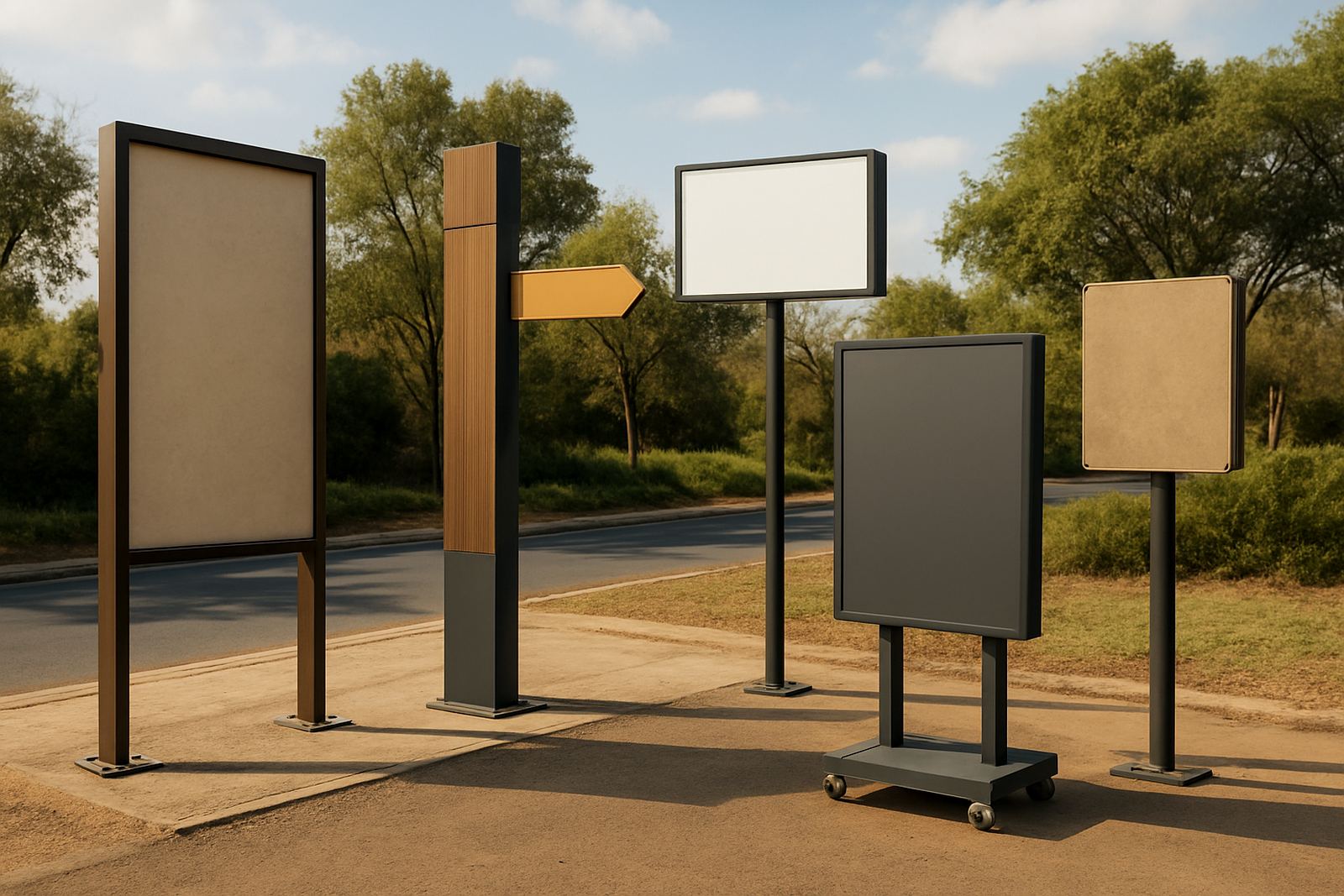
This level also needs to respect speed of movement. A truck driver, pedestrian and courier do not all read at the same pace. That means the sign family should include larger boards for vehicle routes and lower, closer signs for footpaths and entrances. It is a simple fix, but many sites skip it and then wonder why people still stop and phone for directions.
Local directional signs need to finish the trip cleanly
Local directional signs are the final layer. They belong near parking rows, lift cores, stair access points, service yards and doors. These signs are not about introducing the site, they are about removing doubt at the end of the journey.
A useful local sign often carries less text than people expect. By the time someone reaches the final turn, they need confirmation, not a lecture. A clear arrow, level number, unit name or room range can be enough if the earlier hierarchy has done its work.
- Use smaller signs more frequently near final destinations.
- Mount them at eye level where pedestrians naturally look.
- Avoid placing them behind parked vehicles, poles or planting.
- Repeat the same colour code used on earlier signs.
In humid coastal areas such as Durban, these local signs also need the right materials and fixing method so they do not lift, stain or rust over time. On inland sites, dust and sun exposure become the bigger issue, so the finish and print method need to match the environment.
Matching sign type to material and lighting conditions
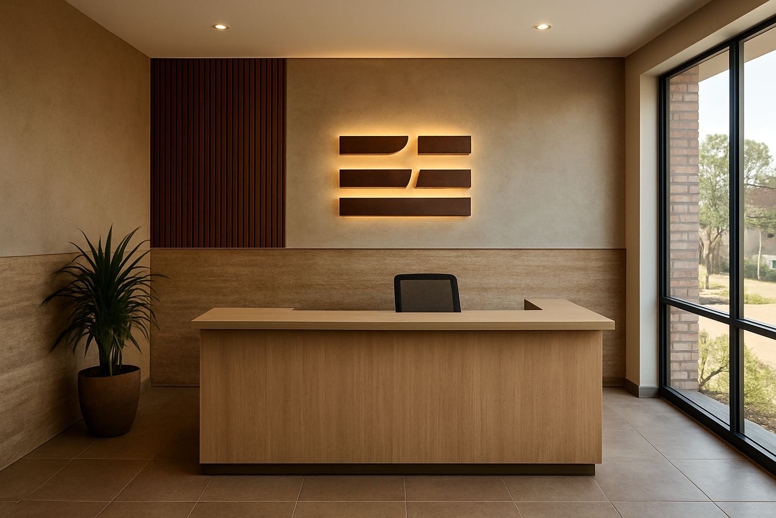
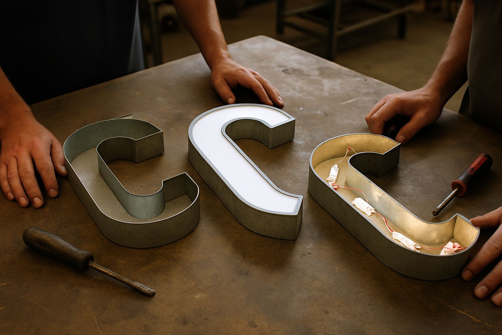
Hierarchy is not only about wording. The physical form of the sign should match its job. A major sign may need fabricated 3D lettering or a light box for stronger presence, while a secondary sign may work better as printed vinyl on aluminium or routered Perspex with clean edge detail. Local signs can often be simpler, but they still need durable fixings and legible contrast.
At night, or during load shedding, illumination can become part of the hierarchy. If the first point of entry is dark and the interior signs are bright, visitors can miss the route from the start. That is why LED integration should be planned with the sign sequence, not added after the fact. Where backup power or low-light conditions are expected, the hierarchy must still read clearly without over-relying on one lit feature.
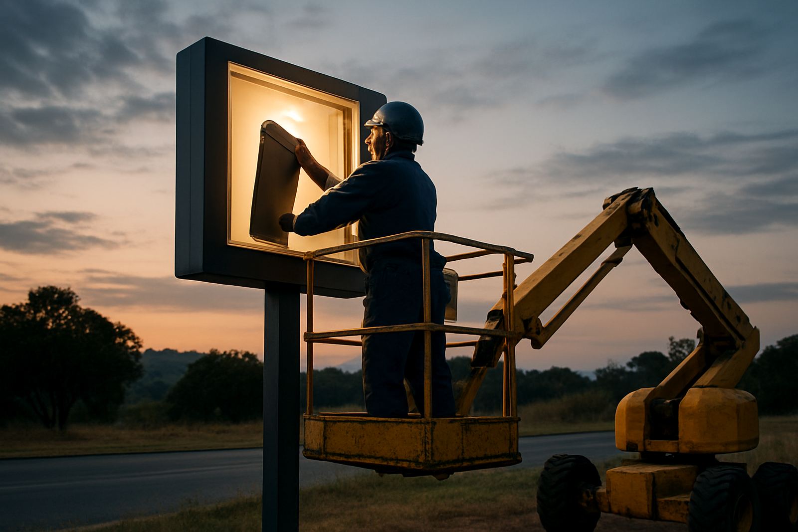
Structural coordination matters as well. Large pylons, road signs and overhead boards must be matched to wind loads, foundations and local approval rules. If the base structure is wrong, the sign may be visible but not practical to maintain.
A Johannesburg example from gate to destination
Take a mixed-use site in Modderfontein with a main gate, visitor parking, office block and service yard. The first major sign at the road names the site and points to visitor access. A second sign inside the gate splits traffic between visitors and deliveries. After that, a secondary sign directs visitors to parking and reception, while trucks are guided to the service route.
Once parked, local signs take over. Pedestrians are shown the lift lobby, stairs and reception counter. Drivers see bay numbers and exit arrows. If there is a conference suite or tenant office on an upper floor, the final sign confirms the floor and unit number without repeating the whole site message. This keeps the route calm, even when the site is busy and people arrive at the same time.
That kind of structure also helps municipal or developer sites where public access changes during the day. A good hierarchy can be adjusted for visitor flow, security checks and temporary closures without replacing every sign on site. That saves time and keeps the message consistent.
Plan hierarchy as a system, not as separate orders
The strongest wayfinding systems are planned in one sequence from the start. Signage Strategy, Site Surveys, Wayfinding Planning, Design Development and Material Specification should all feed the same logic. If each team works in isolation, the result can be a pretty set of signs that still sends people the wrong way.
Before fabrication begins, it helps to answer a short list of practical questions:
- What is the first decision point for a visitor or driver?
- Which routes need to be seen from a vehicle and which from foot?
- Where will arrows, names and numbers repeat, and where should they stop?
- Which signs must remain readable during power cuts or heavy rain?
- What approvals, structural checks or maintenance access will the site need?
When those questions are settled, the hierarchy becomes easier to build, install and hand over. The result is not just more signs, it is a site that feels organised because people can move through it with confidence.