
Start With What People Must See First
In a reception area, the main job is not decoration. It is orientation. Visitors should know who they have arrived to see, where to wait, and which direction to move next. In Johannesburg offices, especially in shared buildings or mixed-use parks, that first reading needs to happen in a few seconds.
The cleanest reception branding ideas often begin with one strong logo element, placed at eye level and scaled to the wall. If the space is narrow, a centred sign can work well. If the counter sits off to one side, the branding should balance the whole wall so the room does not feel lopsided. For a property developer in Sandton or a municipal office in Pretoria, that might mean combining a main wall sign with subtle directional wording nearby.
Good reception branding also has to suit the building. A glass-walled foyer in Midrand calls for different treatment to a warm timber-lined entrance in Durban, where humidity and salt air can affect finishes. In both cases, the sign should be easy to maintain and still look tidy after daily cleaning, load-shedding and long operating hours.
Use Material Contrast To Add Presence
Material choice does a lot of the work before the lighting is even switched on. A plain printed panel can be useful, but when it is paired with cut lettering, brushed metal or clear acrylic spacers, the sign gains a more finished look. That contrast helps visitors notice the brand without needing very large wording.
For many reception areas, a combination of materials gives the best result. Perspex offers a neat polished face, aluminium works well for a firmer corporate finish, and brass can add warmth in executive spaces or older buildings with more character. Printed vinyl is still useful for secondary wording, opening hours or accreditation information, especially where the client wants a cleaner budget control.
- Use a matte backing panel when the room has strong daylight and reflective flooring.
- Choose raised letters for logos and main text so the sign has depth from a side angle.
- Use metallic accents sparingly, because too much shine can feel busy in a small lobby.
- Match the sign finish to nearby counters, wall cladding or joinery for a more settled look.
Where the reception is in a coastal office or a building with more dust movement, sealed finishes and proper fixings matter more than fancy effects. A good sign should still look neat after months of cleaning and daily contact.
Lighting Should Guide, Not Compete
Lighting is one of the simplest ways to improve reception branding, but it has to be planned with care. A sign that is too bright can wash out the logo, while a sign that is too dim disappears under office lighting. The aim is to make the brand readable at normal viewing distance and comfortable for people waiting nearby.
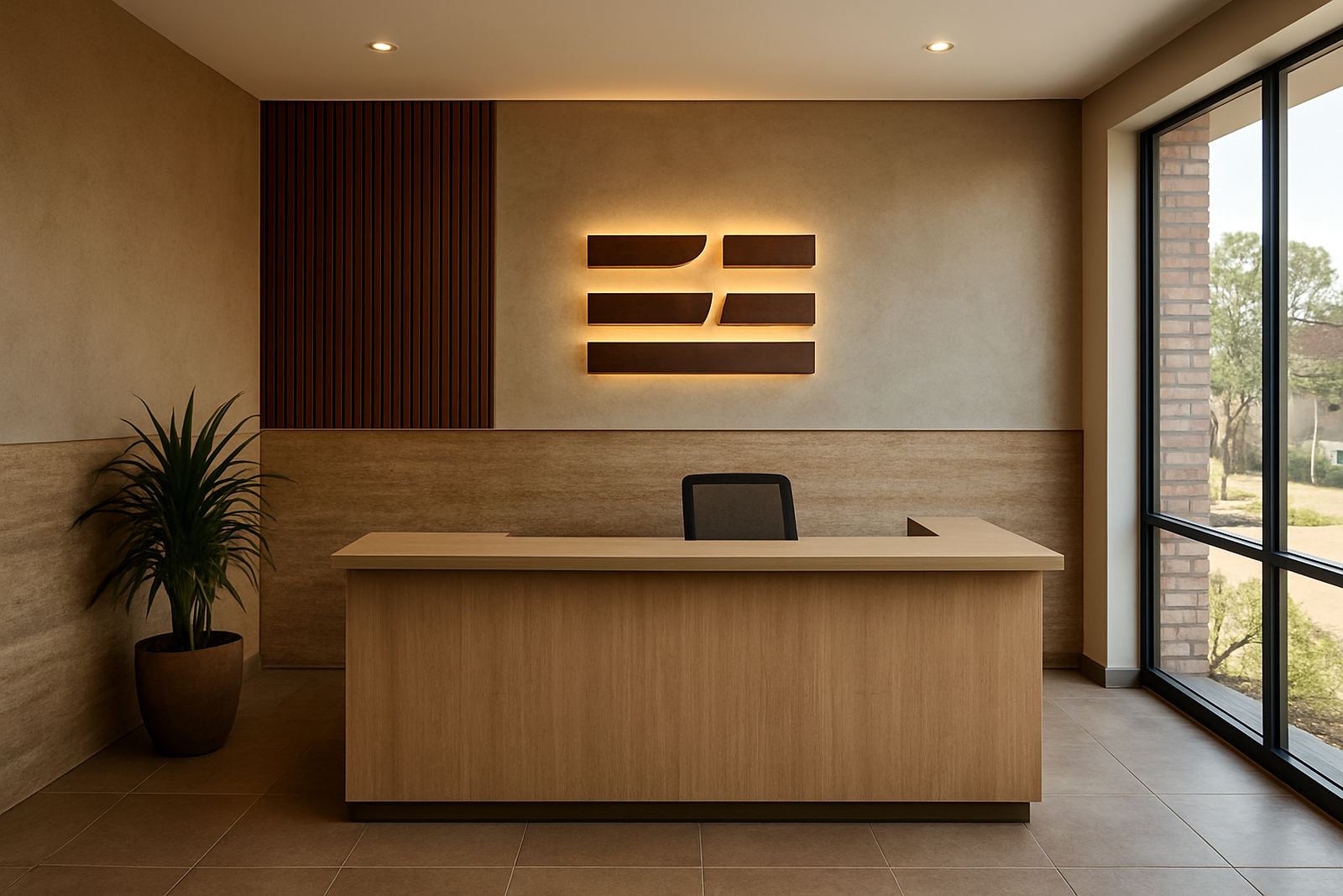
Backlit lettering works well where the reception wall is plain and the client wants a stronger focal point. Halo-lit letters are often better when the brand needs a softer finish. Light boxes still have a place too, especially where a company needs changeable graphics or compliance notices beside the main logo.
In South Africa, lighting also has to cope with power interruptions. If the reception sign relies on illumination to remain visible, it should be designed with the building's backup power in mind. That means proper load planning, safe cabling, and a finish that still looks acceptable when the lights are off. For public-facing sites, especially in government or transport settings, the sign should remain legible in daylight and during load-shedding, not only after dark.
- Use warm white light for more premium or welcoming interiors.
- Use cooler white light where the space is very modern or highly corporate.
- Keep wiring and access points hidden so maintenance does not interrupt the front-of-house look.
- Allow for servicing access, because LED components may need replacement later on.
Dimensional Letters Make A Stronger First Impression
Flat signage can work, but dimensional letters usually give a reception wall more authority. Even a modest depth change can make the branding feel more intentional. This is useful in offices where clients, contractors or residents pass through frequently and need a quick sense of organisation.
Three-dimensional lettering can be routed from Perspex, cut from aluminium, fabricated from metal or built as layered forms for a larger visual presence. The best choice depends on wall size, budget and the tone of the space. A legal or financial office in Sandton may prefer a restrained brushed finish. A mixed-use developer in Germiston may want a stronger, more visible lobby feature that can be seen from the lift line.
When dimensional letters are specified properly, they also photograph well, which matters for annual reports, tenant brochures and project handover records. But the sign must still be practical. Fixings need to hold, surfaces should be easy to clean, and the profile should not catch clothing or bags in a busy passage.
Reception Features That Work Well In Gauteng Offices
Reception spaces in Gauteng vary a lot, from compact suburban offices to large front-of-house areas in business parks. That is why there is no single formula. The most effective schemes usually combine a few controlled elements rather than too many competing details.
For a reliable front-of-house result, consider the following combinations:
- A main logo in dimensional letters above a clean wall panel.
- Backlit lettering with a thin metal frame for a more polished corporate look.
- Printed vinyl graphics for a feature wall, paired with a small raised logo near the counter.
- Acrylic lettering on a timber or textured board where the building has a warmer interior finish.
- A light box for tenancy information, with the primary branding kept separate.
In a local example, a mid-size property team in Modderfontein wanted a reception wall that could stand up to high visitor traffic and still feel professional after evening meetings. The strongest option was a layered sign with raised lettering, a subtle metallic edge, and a soft light source behind the logo. The result read clearly from the entrance, yet did not overpower the rest of the room. It also suited the broader building finish, which meant the sign felt like part of the space rather than something added at the end.
Plan For Installation, Cleaning And Future Changes
Reception branding should be specified with the same discipline as any other part of the fit-out. The wall finish, lighting points, cleaning method and fixing positions all affect the final result. If the sign is installed before the flooring or paintwork is finalised, small errors can become expensive later.
Project teams should also think beyond the opening day. Some brands change names, update logos or merge divisions. A modular sign approach can help with later updates. That might mean separate letters rather than one fixed panel, or a backing system that allows sections to be changed without rebuilding the whole wall.
Maintenance is often overlooked, yet it matters in busy buildings. Dust, fingerprints and indoor climate all change how a reception sign looks over time. A practical finish, with concealed fixings and accessible components, makes the difference between a sign that still feels sharp and one that starts to look tired after a few months.
For organisations working across Gauteng and the rest of Africa, reception branding should also fit the broader corporate standard. What works in Sandton may need small changes for Durban, Pretoria or regional sites, especially where humidity, transport vibration or different municipal requirements come into play.