
Why hospital wayfinding has to work under pressure
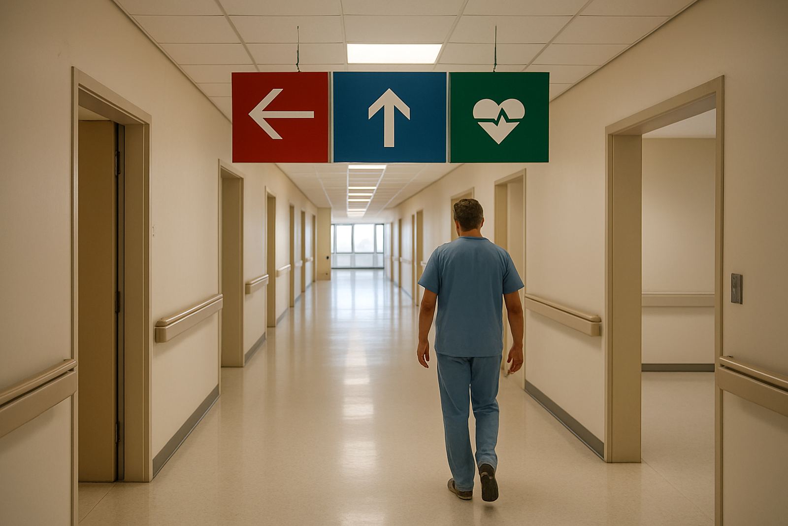
Hospital signage carries more weight than most people think. Visitors arrive anxious, often after dark, sometimes with a child on their hip or an older relative in a wheelchair. Staff are moving between wards, theatres and admissions, and a delay of even a minute can matter. That is why hospital wayfinding must prioritise urgency, accessibility and plain language before any branding flourishes.
In a healthcare setting, the sign is doing a job, not making a statement. It has to be readable at a distance, placed where people actually decide to turn, and consistent across the whole site. If one corridor says Medical Outpatients and another says Out Patients, or if a parking level uses different colours from the main entrance route, people lose confidence fast.
Good hospital wayfinding also reduces stress on reception teams and security guards, who should not have to repeat the same directions all day. On larger campuses, especially in Gauteng where hospitals often have multiple blocks and growing parking decks, clear signage saves time and avoids bottlenecks at peak visiting hours.
Start with the journey a patient actually makes
Before a single sign is sized or fixed, map the full patient journey. Think from gate to reception, from reception to the correct floor, then from ward to pharmacy, radiology, casualty, maternity or discharge. Visitors do not follow the building plan in a neat line. They arrive from taxis, rides, ambulances, staff entrances and basement parking, so the route must be planned from the user side.
Wayfinding planning in hospitals usually needs more than directional arrows. It needs a hierarchy of messages, with each one answering one question only. If you try to say too much on one sign, people miss the key point. Keep the wording short and the route logical.
- Main entrance identification
- Parking and drop-off routes
- Reception and admissions directions
- Department signs for wards, clinics and support services
- Floor and lift lobby markers
- Emergency routes and restricted access zones
A practical site survey should also note where light falls during the day, where people queue, and where temporary obstructions appear. At a busy hospital in Pretoria or Sandton, a sign hidden behind a planter or security boom is useless, no matter how good the print is.
Plain language beats clever wording every time
Hospitals serve the full public, so wording must be direct. Use everyday terms first and avoid internal shorthand where possible. If a department is commonly called Casualty, Emergency or Maternity by patients, that is often better on the sign than a clinical label that only staff use. The aim is to reduce hesitation, not impress anyone.
Accessibility matters just as much as the wording. Letter size, contrast and mounting height all affect whether a sign can be read by someone with poor vision, a person using a wheelchair or someone standing at the wrong angle in a crowded corridor. In coastal towns humidity can also affect finishes, so materials need to stay legible and secure over time.
- Use high contrast colours with matt finishes where possible
- Keep the message short and readable from the expected viewing distance
- Include symbols where they support the words, not replace them
- Avoid jargon, abbreviations and long department names
- Allow for both English and local language needs where required by the site
We often see hospitals improve flow simply by changing the wording on a few key signs. A clearer reception sign, a better lift lobby sign and a more visible clinic directory can cut confusion quickly.
Materials and construction for busy healthcare sites
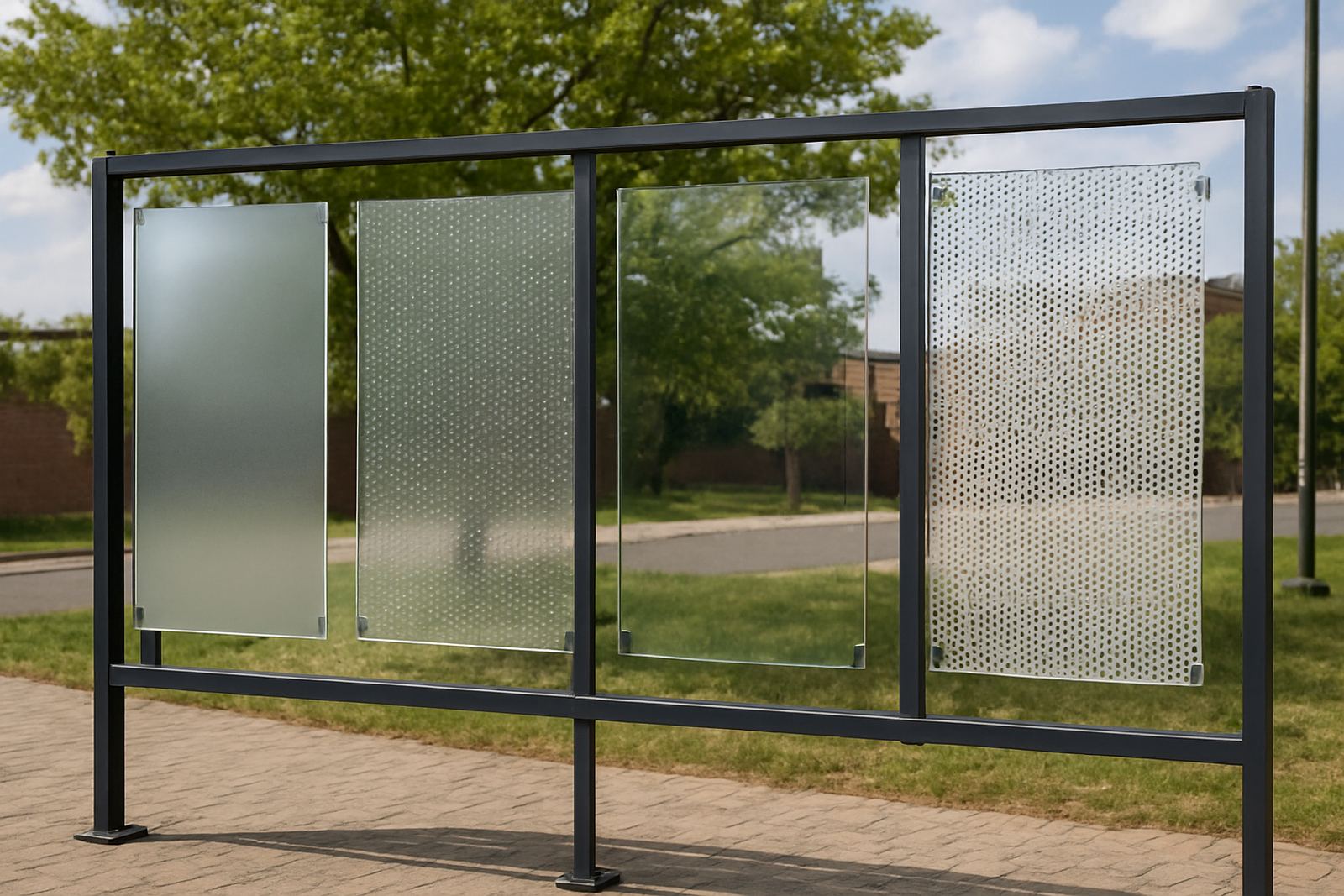
Hospital signs take a beating. Trolleys brush against them, cleaning chemicals are used daily, and some areas are exposed to sunlight, humidity or dust. For that reason, material choice should be practical, durable and easy to maintain. Acrylic, aluminium, Perspex and printed vinyl each have a place, but only when specified for the right location.
For exterior wayfinding at the gate or along internal roads, fabricated panels, pylons and road signs need to hold up in wind, rain and strong sun. In patient-facing areas, smooth finishes are easier to clean and less likely to trap dust. For night visibility, illumination can help but it must be controlled so it does not create glare near wards or waiting areas.
Hospitals that run through load-shedding also need a careful lighting plan. A sign that works in daylight but disappears after dark is not enough. Where required, reflective finishes, backed lighting or LED integration can keep critical routes visible when the power is unstable.
Approval, compliance and structural coordination matter
Healthcare facilities usually involve multiple decision makers and strict approvals. That can include hospital management, facility teams, architects, engineers, landlords, municipal departments and sometimes health authorities. Signage must be coordinated with structure, fire routes, services and access control, not added as an afterthought.
Structural checks matter for large signs, overhead gantries, wall-mounted directories and any item fixed to cladding or masonry. If a sign is too heavy for the substrate, or positioned over a service route, it becomes a maintenance problem and a safety risk. Approval support should also cover visibility from vehicle approaches, pedestrian paths and emergency access points.
A good process keeps the project moving and avoids costly rework. It is easier to correct a sign schedule before fabrication than after a panel has been cut and drilled.
- Confirm sign locations against the latest floor plans and site conditions
- Check mounting surfaces, cable routes and access for maintenance
- Align message content with hospital terminology before production
- Plan installation around operating hours and patient movement
- Allow for future changes, expansions and department relocations
A Gauteng hospital example: one campus, many users
Consider a busy hospital campus in Johannesburg with visitors arriving from Modderfontein, Germiston and Midrand, plus staff coming from Pretoria and Centurion. The site has multiple entrances, a parking basement, a main reception, outpatient clinics, a maternity wing and an emergency unit. Without a clear wayfinding plan, everyone heads to the wrong door at least once.
In a case like that, the first fix is usually a clear entry sequence: gate identification, parking guidance, main entrance marking and a bold reception directory. After that come directional signs at every decision point, then department identification at the destination. If the hospital also has a digital screen at reception, it can be used for temporary notices, clinic changes and emergency updates, but it should never replace the core directional system.
For healthcare projects, the real measure of success is not how many signs were installed. It is whether a first-time visitor can find the right place without asking three different people. That is especially important in high-pressure settings where every minute counts and tempers are already thin.
Maintenance keeps the system useful after handover
Even the best signage plan needs maintenance. Departments move, phone numbers change, walls get repainted and signs can be damaged by trolleys or weather. A hospital should hand over a simple maintenance plan that shows what each sign is for, who is responsible for updates and how replacements are ordered.
Routine checks should cover fading, loose fixings, lighting faults, peeling vinyl and any signs blocked by new furniture or equipment. In busy facilities, quarterly inspections are often worth the effort because they catch issues before patients do. Good handover documentation also helps the maintenance team keep the look consistent instead of replacing one broken sign with something that does not match.
At Deep3 Signage Consultants, that is the point of the work: strategy, surveys, design development, material specification, structural coordination, approval support, fabrication management, installation management and practical handover. Hospitals need signage that helps people move with confidence, not signs that create another problem to solve.