
Why school campuses need clear wayfinding
On a busy school morning, the first problem is often not the classroom itself but the route to it. Parents stop at gates, younger learners drift toward the wrong block, and visitors end up asking for the office, the hall or the sports field. Good campus navigation removes that friction by turning a large site into a set of easy choices.
For schools in Johannesburg, Pretoria, Durban or coastal towns where humidity and rain can fade low grade signs quickly, the system must be practical as well as neat. A campus plan should work in bright sun, after load-shedding when exterior lights are off, and during peak drop-off when movement is at its busiest. The goal is not just to label buildings. It is to help people understand where they are, where they need to go, and what areas are for learners, visitors, staff and deliveries.
We find that the best school wayfinding starts with the site itself. Boundary walls, vehicle access, pedestrian routes and gathering points all need to be mapped before any sign is placed. If the entrance sequence is confusing, no amount of small labels will fix it.
Start with zoning before you add signs
Simple zoning is the foundation of a school navigation system. Instead of trying to sign every door, create clear zones such as administration, foundation phase, senior phase, sports, assembly, parking and services. Once those zones are defined, the signage can do its job with far less clutter.
A campus that is organised by zone is easier for children to remember. A learner does not need a long instruction, only a short one such as "follow the blue path to the Grade 1 block" or "meet at the green court entrance". That is especially useful on larger campuses with separate buildings, ramps and internal courtyards.
Typical zoning tools include:
- Colour bands for each phase or block
- Names that are short and easy to pronounce
- Numbered buildings or courts for quick reference
- Maps at gates and main decision points
- Floor or wall markers that repeat the same system indoors and outdoors
When the same logic is used across the full campus, learners build familiarity faster. Staff also spend less time giving directions over and over.
Use colour cues that suit age and movement
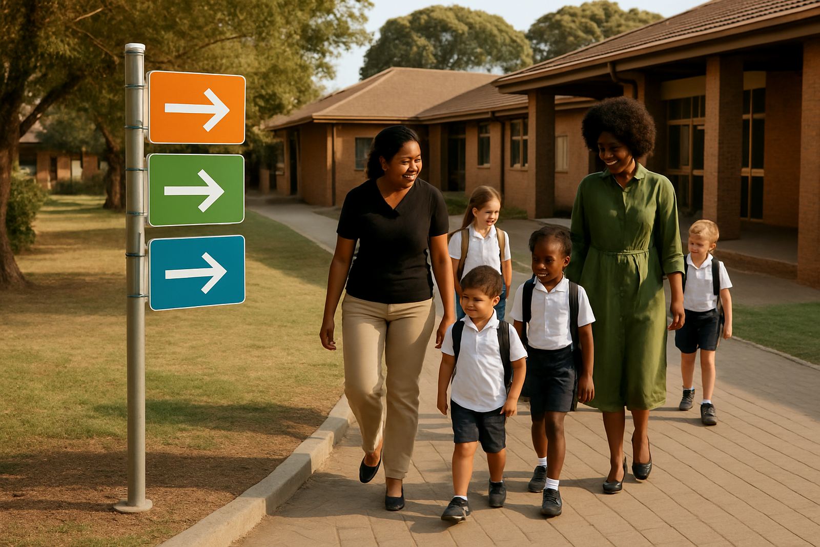
Colour is one of the fastest ways to guide movement, but it has to be used carefully. Too many colours make a campus feel noisy, while too few make it difficult to separate different parts of the site. The trick is to assign each zone a clear colour and keep that colour consistent on gates, arrows, notice panels and block identifiers.
For younger learners, bright but limited colour cues work well because they are easy to spot and remember. For older learners, the system can become more restrained, using stronger contrast and fewer decorative elements. In both cases, the text must remain legible from a distance. White on dark backgrounds, or dark lettering on light panels, usually works better than pale colours on reflective surfaces.
Schools near the coast often deal with glare, salt air and moisture so the finish matters. Powder-coated aluminium, quality vinyl, Perspex and properly sealed fixings can hold up better than cheaper materials that peel or rust. If a sign sits in strong sun all day, the lettering should be tested for visibility at different times, not only in the shade.
Practical colour use should always support the route, not compete with it. If the environment already has strong building colours, the wayfinding colours must be distinct enough to stand apart without creating confusion.
Age-appropriate wording helps children move independently
Children do better with short, direct instructions. That means signage should be written for the age group moving through the campus. Foundation phase learners need simple words, arrows and pictures. Middle and senior learners can handle more detail, but they still benefit from plain language and clear direction.
Directional wording should avoid long sentences and unnecessary abbreviations. A sign that says "Reception and Visitor Entry" is clearer than a panel full of internal terminology. For younger children, pictograms can support the text, especially for toilets, dining areas, library access and assembly points.
Good school signage often includes:
- Simple arrows with one instruction per sign
- Large lettering at eye level for children and adults
- Consistent naming across maps, walls and gates
- Symbols for toilets, library, hall and sports areas
- Friendly but clear language such as "This way" or "Stop here"
Where schools have multiple arrival groups, separate language may be needed for visitors, parents and service vehicles. That keeps pedestrian routes safe and reduces cross traffic near the gate. It also helps during school events when temporary movement patterns change.
The practical details that keep a campus working
Campus navigation is not only about the visible sign face. It is also about how each item is mounted, lit and maintained. A sign that is too high, too small or too close to a wall can be hard to read even if the wording is perfect. The placement must take account of sightlines, vehicle turning paths, wheelchair access and evening visibility.
For schools with aftercare, sports fixtures or evening functions, exterior lighting matters. Where power interruptions are common, reflective elements and strong contrast help people move safely even when lighting is reduced. In some cases, low energy lighting or solar backed systems can be used at entrances and along key walkways.
Maintenance planning should be part of the original scope. This includes cleaning schedules, replacement of worn panels, repainting of faded markers and checks after storms or vandalism. If a campus is in a windy area or near busy roads, fixings need to be specified for that site rather than copied from another project. Small issues become big problems quickly when children are using the space every day.
Approval support can also matter where municipal rules, safety requirements or access control conditions apply. A school should not be left with a beautiful sign that was never checked against the site constraints. The best outcome is one that works on paper, on site and during daily use.
A Johannesburg example: from confusing blocks to clear routes
Consider a school in the Modderfontein and Edenvale area with a front gate, a separate sports entrance and several classroom blocks spread across a long site. Visitors were arriving at the wrong gate, younger learners were walking against traffic and staff were spending too much time redirecting people during peak drop-off. The main issue was not the number of signs, it was the lack of a single navigation system.
The site was first divided into clear zones: administration, foundation phase, senior classrooms, hall, sports and services. Each zone received its own colour cue and naming pattern. Directional panels were then placed at the gate, near the parking area, at major junctions and at the change points between blocks. Floor markings and wall signs repeated the same logic indoors so the route stayed familiar from outside to inside.
The result was simpler movement, fewer questions and better control at arrival and departure times. Learners could find their areas faster, and visitors had a clearer path without needing constant assistance. That kind of improvement is especially valuable on a busy Gauteng campus where the school day starts quickly and everyone is arriving at once.
What to include in a school navigation brief
A useful brief gives the signage team enough information to plan the site properly. It should include the campus layout, current issues, key user groups and any safety concerns around gates, stairs, crossings or parking areas. It also helps to know which routes are used by foundation phase learners, which are used by visitors, and where event traffic changes the normal pattern.
Before specifying materials and positions, the following points should be checked:
- Main entrances and secondary access points
- Pedestrian routes from gate to classroom blocks
- Areas that need visitor only direction
- Sports, hall and assembly movement during events
- Weather exposure, glare and maintenance access
Starting with site surveys, design development, material specification and installation management, the process continues through to handover so the final system suits the actual school instead of a generic plan. For schools across Gauteng and further afield, this keeps the campus legible long after the new signs are installed.