Why commuter signs are judged in seconds
Transport signage lives under pressure. A commuter may be moving through drizzle in Durban, late afternoon glare in Pretoria, or a crowded platform in Sandton with a queue behind them. They are not standing still to study a panel. They are looking for a platform number, route name, rank, bay, or exit direction before the next vehicle closes its doors.
That is why legibility matters more than decoration. If the first reading fails, the whole system slows down. People hesitate, crowd the wrong entrance, miss a turning, or ask for directions that the sign should have answered. At interchange level, a good sign reduces confusion and keeps foot traffic moving. A poor one creates pressure on staff and makes a site feel untidy even when the structure itself is in good condition.
The rule is simple: the sign must be read fast, from the right distance, and in the right order. In transport work, the hierarchy is the message.
Build the hierarchy before you choose colours
A sign should tell the eye what matters first, second and third. The biggest mistake on passenger signage is giving every line the same weight. When route names, symbols, bay numbers and service notices all compete, nothing stands out.
Start with the question a commuter is actually asking. Is this the right platform? Which lane is for buses, minibuses or staff vehicles? Where is the pedestrian crossing? Once that is fixed, the layout can be planned so the main message sits highest and the supporting detail sits lower.
- Use one primary message per face where possible
- Keep route names larger than supporting notes
- Place arrows close to the destination text, not far away
- Separate warnings from wayfinding so they do not fight for attention
- Leave enough blank space so the eye can rest between elements
Colour helps, but only when it is disciplined. High contrast between text and background matters far more than a busy palette. Yellow on black, white on dark blue, or black on reflective light backgrounds can work well depending on the setting. On sunlit routes in Gauteng, weak contrast disappears quickly. At night, reflective finishes or backlit faces may be needed where vehicle headlights and low ambient light affect reading.
Materials that stay readable in heat, dust and coastal air
Transport signs are exposed to more wear than most people realise. Dust, sun, vibration, vehicle exhaust, rain and cleaning chemicals all affect how long a face stays readable. On an inland site, UV exposure can fade printed elements and make colours look washed out. On coastal routes, salt air can attack fixings and edges if the wrong materials are specified.
For this reason, the material choice must match the site conditions and maintenance plan. A signboard for a bus rank in Germiston will not need the same finish as a coastal pedestrian route in Durban. The structure, face material, inks, laminates and fixings all need to be considered together.
- Choose substrates that stay flat and do not warp in heat
- Use coatings that can cope with cleaning and regular wiping
- Specify fixings that resist corrosion where moisture is common
- Allow for replacement panels where service information changes often
- Check that the finish remains legible under direct sun and under canopy shade
Temporary notices also need planning. If a site runs on borrowed boards and hand-written updates, legibility drops very quickly. A proper system allows for quick panel changes without forcing the whole sign to be remade every time a route changes or a bay is reassigned.
The reading distance test on roads, bays and platforms
Legibility is not only about print size. It is about how far away a person is when they first need the answer. A driver approaching a road sign needs a different character height from a pedestrian in a concourse. A platform marker seen from across a lane needs stronger contrast than a notice read at arm’s length.
Before signoff, the layout should be checked against actual movement on site. Where do people enter the space? Where does a taxi stop? How quickly do vehicles pass the sign? Is there lighting from above, behind or from the side? These questions decide whether the message lands cleanly or gets lost in the noise of the environment.
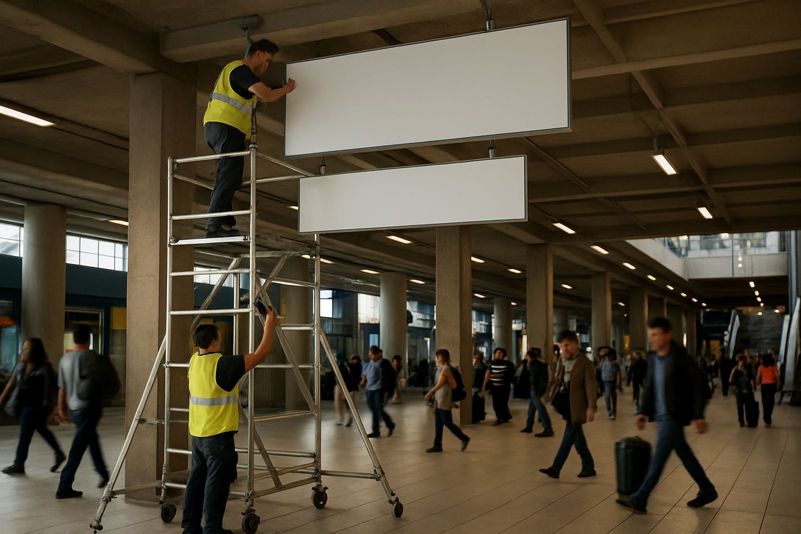
On a large interchange in Midrand, for example, a route board that looked acceptable on paper became hard to read once it was mounted above head height and seen against a bright morning sky. The solution was not to add more text. It was to simplify the wording, increase letter spacing, and adjust the mounting angle so the main message was visible before the commuter reached the conflict point. That small change improved flow straight away.
Any transport sign that forces a second look is already costing time.
Wayfinding works best when the whole route agrees
Transport legibility is not just one board at one point. It is a chain. If the entrance sign says one thing, the platform marker says another, and the exit sign uses a different naming system, people lose confidence. They begin asking staff instead of following the signs, and the pressure shifts onto the human team.
The answer is consistency. The same language, symbols, colours and numbering should appear from the first approach road to the final boarding point. That includes the way signs are spaced, the way arrows are used, and the way service notes are phrased. Even small changes in wording can slow down recognition for regular passengers.
For municipalities and developers, the best results come when signage strategy is part of the transport plan from the start, not something added near handover. When the sign family is coordinated early, approvals are easier, fabrication is neater and the site opens with a clear system instead of a patchwork.
- Use the same naming convention across maps, boards and bay markers
- Keep symbols consistent for arrivals, departures, transfers and exits
- Do not mix informal wording with formal transport instructions
- Check that emergency routes and public routes are not visually confused
- Update all linked signs together when a route or bay changes
Practical checks before fabrication and installation
A legible sign is usually the result of careful checking long before it reaches site. The artwork, structure, approvals, fixings and lighting all affect the final reading. If any one of those is rushed, the finished sign may look fine in the workshop but fail in traffic.
For transport work, we recommend checking the full chain: site survey, material specification, structural coordination, fabrication management, installation management and maintenance planning. That approach is especially useful where signs must be mounted above circulation routes, close to traffic, or on structures that have to take wind loading and regular vibration. In those conditions, even a small movement can affect how quickly a panel is read.
It also helps to plan for cleaning access and future updates. Passenger information changes often, and a sign that cannot be maintained becomes a liability. Good legibility is not a one-time achievement. It is a system that stays clear after rain, dust, repairs and use.
At Deep3 Signage Consultants, we work on transport-facing signage for brands, developers and municipalities across Gauteng and beyond, from Modderfontein, Sandton and Randburg through to Pretoria, Centurion, Germiston and Durban. The aim is always the same: make the message easy to read, easy to trust and easy to follow.