Why a precinct needs one visual rulebook
When a precinct grows across several stands, buildings and phases, signage can quickly become patchy. One tenant wants brushed metal letters, another wants printed vinyl, and the next phase adds a different shade of blue. The result is not just untidy, it confuses visitors, complicates maintenance and weakens the identity of the site.
Brand consistency means every sign in the precinct follows the same system. That includes font choices, colours, panel sizes, fixing methods, lighting levels and even how directional arrows are used. In Johannesburg and Pretoria, where developments often mix offices, retail, logistics and residential zones, that common system helps a site feel planned rather than pieced together.
A precinct wide signage standard is also practical. If a municipality asks for adjustments, or a property manager needs a replacement after storm damage, there is already a reference point. Materials can be matched, drawings checked and the next phase kept in step with the first. That saves time and avoids small mismatches that become obvious once the full site is occupied.
The first step is a proper sign hierarchy
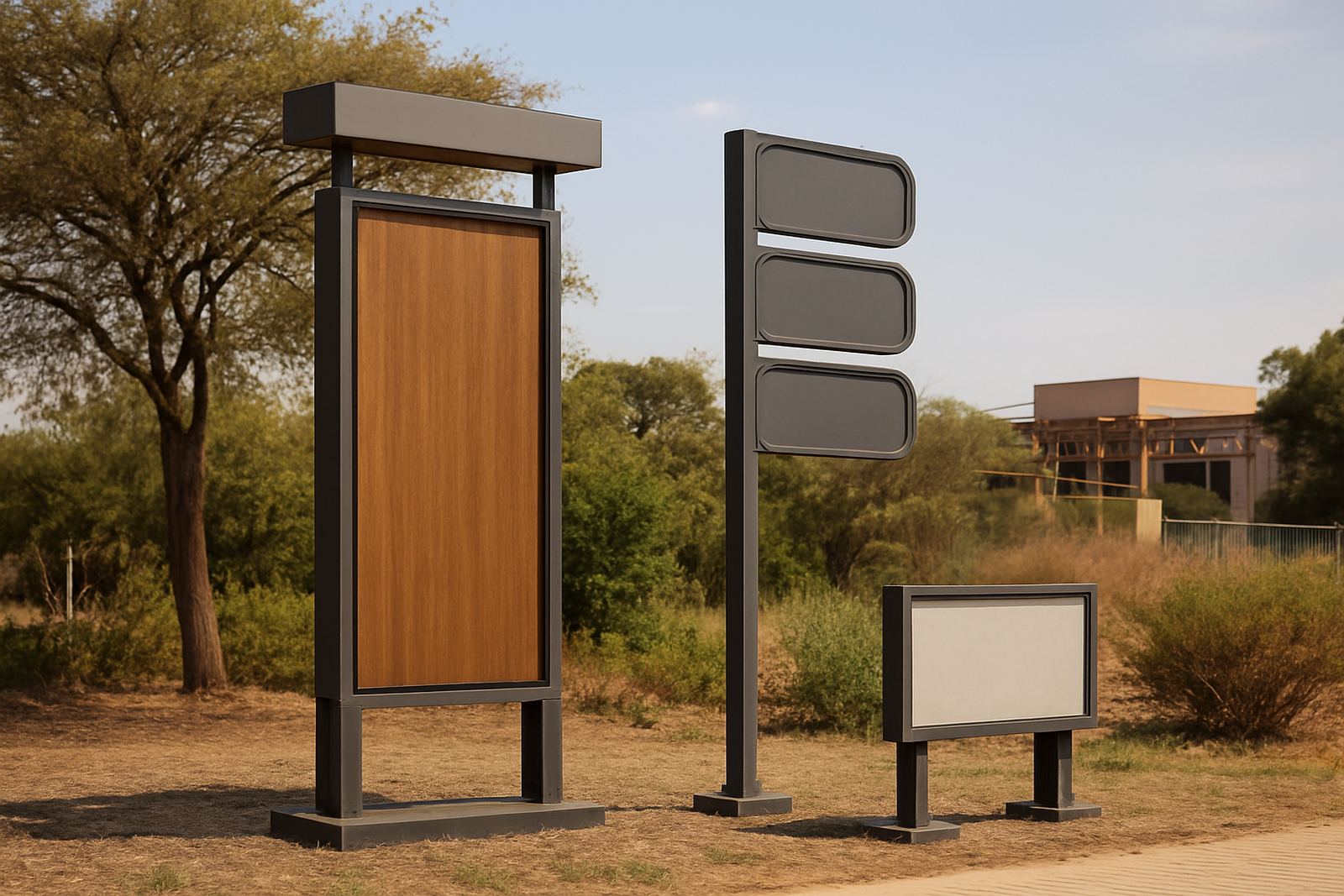
Not every sign should carry the same weight. A main entrance pylon, a wayfinding blade and a parking level marker all serve different jobs. The problem starts when they are treated as equal. A good precinct plan sets a hierarchy so each sign is clear in its own role and still belongs to the same family.
For a mixed use site in Modderfontein, for example, the entrance sign may need to hold the overall precinct name, while internal signs focus on tenant directions, pedestrian paths and loading access. On a busy site with heavy vehicles, visitor traffic and security control points, the wrong sign in the wrong place creates delays and frustration.
- Main identity signs at road edge and entry points
- Directional signs for vehicles and pedestrians
- Building identification at each frontage and lobby
- Regulatory signs for speed, access and safety
- Tenant and phase markers that can be updated later
Once the hierarchy is set, the rest of the programme becomes easier to manage. Fabrication, installation and future maintenance all follow the same order of importance.
Materials should match the climate and the maintenance plan
Brand consistency is not only about appearance. It also depends on how materials behave over time. A precinct near the coast will face salt air and faster corrosion. In Gauteng, strong sun, dust and summer storms can fade prints and loosen fixings. Add load shedding and the risk of unplanned darkness, and lighting choices must be sensible not decorative.
That is why material specification matters. Routered Perspex, aluminium, brass, fabricated 3D letters and printed vinyl all have their place, but they need to be chosen with the environment in mind. If one sign is powder coated and another is left exposed, the site ages unevenly. If LED screens are added, the power supply and access for servicing must be planned from day one.
For developers and municipalities, the maintenance plan should be part of the sign standard, not an afterthought. A precinct with replaceable face panels, accessible wiring and common fixing details is easier to keep in order over five or ten years. That matters when the site spans multiple buildings and the team changes over time.
Wayfinding works best when people do not have to think about it
A coherent precinct is one where people can find the entrance, parking, lift core and exit without stopping to ask for help. Good wayfinding is quiet. It leads the eye, repeats the same cues and avoids clutter. If the signs use different colours, different arrows or different naming conventions, the user has to stop and make sense of the system.
In Sandton or Midrand, where commercial sites often have layered access control, visitor parking, delivery routes and shared basements, wayfinding must be especially clear. The route from boom gate to reception should feel like one journey. The same should be true for service access and emergency routes. If the precinct uses multiple languages or icons, those choices need to be applied consistently across every sign.
- Use the same term for the same destination everywhere
- Keep arrow styles and icon sets uniform
- Position signs at decision points, not after them
- Match lettering sizes to viewing distance
- Repeat key landmarks so drivers and pedestrians stay oriented
When the wayfinding system is strong, the precinct looks more organised and performs better in daily use. People move faster and security teams deal with fewer unnecessary questions.
Approval support saves time before fabrication starts
Many precincts lose weeks because the signs are designed first and checked later. That is backwards. Approval support should happen early, especially where road frontage, municipal bylaws, landlord requirements and safety rules all overlap. A sign that looks right on a sketch may still fail on height, placement or lighting once the site is measured properly.
For a development in Germiston or Pretoria, this can affect everything from pylon size to the visibility of a road sign. If the precinct borders a main road, the structure may need structural coordination, traffic consideration and the right spacing from services. If the site includes a billboard or LED screen, the rigging and access method must be agreed before fabrication begins.
Clear approvals are not red tape for its own sake. They keep the precinct consistent by preventing last minute changes that force one sign to look different from the rest. Once the standard is signed off, it becomes easier to roll out later phases without starting over each time.
A Johannesburg example: one precinct, many users
Consider a mixed development in Modderfontein with office blocks, a retail edge, a parking structure and a municipal access road. The site needs identity at the street, tenant names at the buildings, traffic control at the gate and directional signs inside the parking areas. If each contractor handles a portion separately, the result can be clashing colours, mixed fixings and uneven lighting. That is where precinct brand consistency makes a visible difference.
Our approach starts with signage strategy and site surveys, then moves into design development, material specification and structural coordination. The same team then manages fabrication, installation and final handover so the system stays aligned from first drawing to final bolt. On a real site, that means the entrance pylon, the wayfinding panels and the internal tenant signs all share the same family of proportions and finishes.
For brands, developers and municipalities, the benefit is simple. The precinct feels planned, the signage is easier to maintain and the whole site presents one clear identity. In a city as active as Johannesburg, that kind of order is not cosmetic, it is part of how the place works.
How Deep3 keeps precinct signage aligned from start to finish
From Modderfontein, projects are supported across Gauteng, Durban and the rest of Africa. The role is to ensure precinct signage is specified, built and rigged as one coordinated system rather than a collection of separate jobs. That includes printed vinyl, routered Perspex, aluminium, brass, fabricated 3D lettering, pylons, road signs, billboards and LED video screens.
The practical value is in the coordination. Leanne van Wyk manages operations, Sakhile Motsepe handles project engineering, Thandiwe Ndlovu leads design and visualisation, Riaan Smit oversees fabrication and Omolemo Msiza coordinates site rigging. Under Sibusiso Mthembu, the work stays tied to one standard from survey to handover.
If your precinct is in Sandton, Randrand, Centurion or Durban, the same rule applies: the signs must look related, perform properly and be easy to maintain. That is what brand consistency is for, and it is what keeps a large development readable long after the opening day.
- One standard for colour, font and finish
- One plan for approvals and structural checks
- One maintenance approach for the full precinct