Why warehouse branding has to read at speed
Industrial sites do not get the same attention span as a shopfront in a mall. A delivery driver may have seconds to spot the correct gate, a contractor might be scanning from the road, and a first-time visitor could be trying to read directions while dealing with traffic, rain or poor lighting. That means warehouse branding has to do more than look neat. It must carry enough scale, contrast and clarity to work at a distance.
On large façades, size decisions should start with viewing distance. A sign that looks generous when you stand close to it can disappear once you are 60 metres away, especially on a busy road edge in places like Modderfontein, Germiston or along the industrial routes into Pretoria and Midrand. We usually look at where vehicles slow down, where pedestrians approach, and where line-of-sight gets interrupted by boundary walls, gate houses, tree cover or parked trucks.
How sign size changes by approach route
The same warehouse can need three different scales of branding on one site. The road-facing identification may need to work for passing traffic at higher speed, while the gate sign should support short-range reading for staff and couriers. A façade logo might be larger still if the building sits back from the road or behind other structures.
As a practical guide, the sign should be sized to the slowest likely reading point, not only the closest one. That usually means checking approach routes from the main road, the guardhouse and the loading yard. In Gauteng, where many industrial parks have long internal roads and mixed truck movement, the wrong proportion can create confusion at peak delivery times.
- Road-edge identification should be visible from the nearest safe stopping point
- Gate branding should be clear enough for visitors to confirm they are at the correct entrance
- Loading-bay markings and directional signs need to support movement inside the yard
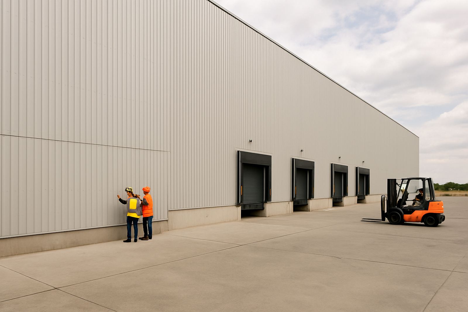
- Large façades may need split branding if one wall is broken by roller doors or services
Materials that hold up on big industrial buildings
Scale is only useful if the material survives the site. A warehouse in Johannesburg may face dust, hail and strong sun. A site closer to the coast, such as Durban, brings humidity and salt exposure that can shorten the life of untreated components. That changes what should be specified for the face panel, framing, fixings and print method.
For large façades, we often consider aluminium panel systems, fabricated 3D lettering, routered Perspex, printed vinyl on suitable panels, and illuminated options where night visibility matters. Structural coordination is important because a sign that is oversized for the wall can create problems with wind load, access, or fixing points. If the building is cladded, the fixing method has to suit the substrate, not just the artwork.
Load-shedding also matters. If the site uses illuminated signage or LED elements, the design should still look correct in daylight, with legible branding when power is off. That is where contrast, depth and spacing become important. A good sign should still carry the company name even if the lighting is out.
Where warehouse branding goes wrong
Many industrial signs fail because they are designed as decoration rather than navigation. A logo may be attractive in the boardroom, but if the letters are too thin or the colour sits too close to the wall colour, the sign disappears from the road. Another common issue is crowding too much information onto one face. Warehouses need quick recognition, not a full company profile on the façade.
It also happens when the sign is scaled to the elevation drawing instead of the actual site. A wall can look massive on paper but still be blocked by roof overhangs, fire services or yard equipment. Good signage planning starts with a site survey, measuring the real wall, the viewing angles and any municipal or landlord limits before fabrication begins.
- Thin letterforms can lose legibility at distance
- Too many lines of text slow down reading
- Low-contrast colours can disappear in bright daylight
- Fixing points need to suit the actual wall build-up
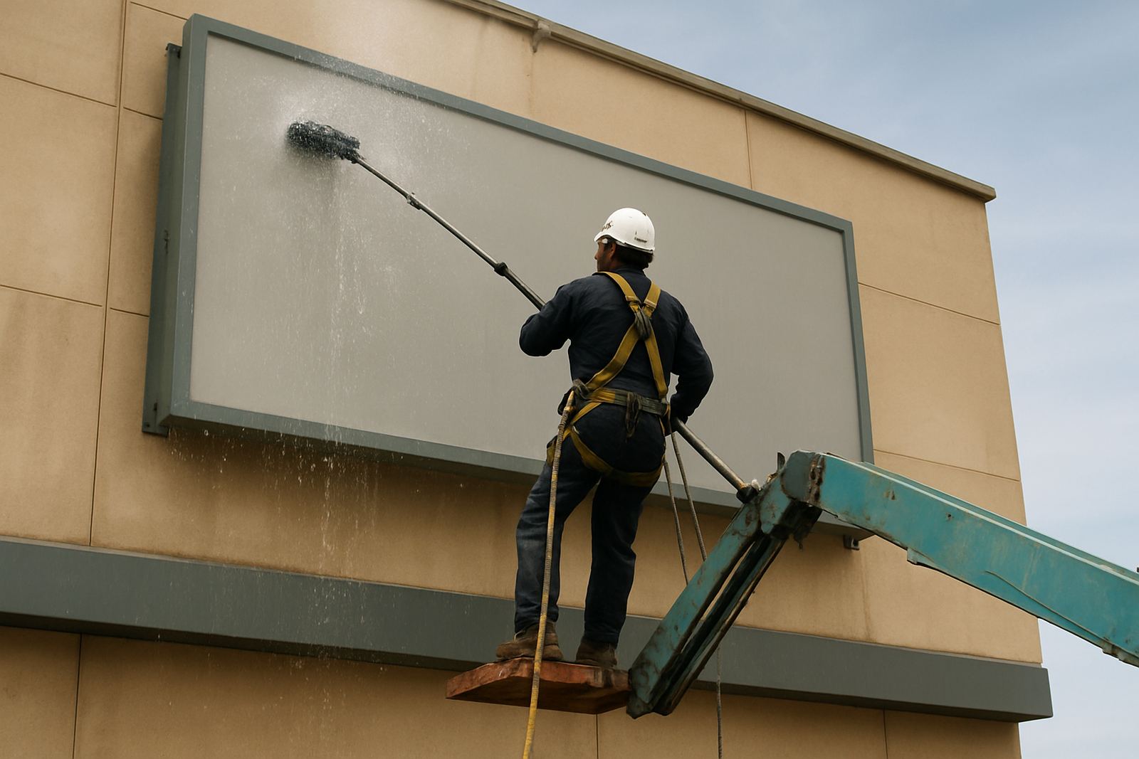
- Access for cleaning and maintenance should be planned from the start
A practical example from Modderfontein
For an industrial property in Modderfontein, the brief was simple: staff, contractors and delivery trucks needed to find the right warehouse without circling the block. The site sat back from the main access road, with a busy gate, tall boundary walls and a loading area that was visible only once vehicles had already turned in. A small sign would have been wasted there.
The answer was a layered approach. A larger façade sign identified the building from the road, a separate gate sign assisted arrivals at the entrance, and directional markers were added inside the yard for loading bays and office access. The result was less confusion at peak times and fewer wrong turns, which matters when trucks are trying to move in and out quickly. That kind of solution is common across Sandton, Randburg, Centurion and the industrial belts around Johannesburg, where one site often serves staff, visitors and freight traffic at the same time.
What to decide before fabrication starts
Before anything is built, the sign strategy should settle the purpose, size, fixing method and approval path. For warehouse branding, this is where the project is won or lost. A clear specification avoids expensive changes once the steel is cut or the face panels are already printed.
At this stage, the team should confirm visibility distances, mounting positions, structural requirements, lighting needs and any municipal or landlord approvals. On larger projects, it also helps to plan maintenance access, especially where signs are mounted high above docks, gates or truck circulation areas. If the sign will include LED screens or dynamic content, the structure and power supply need to be coordinated early so the installation is safe and compliant.
- Confirm the primary viewing distance for each sign face
- Check wall strength, roof edges and access points
- Plan for daylight visibility and night visibility separately
- Allow for cleaning, repair and lamp or component replacement
- Keep branding readable even when trucks or equipment are parked nearby
Industrial sites across Gauteng and further afield are supported from Modderfontein, Johannesburg with signage strategy, site surveys, wayfinding planning, material specification, structural coordination, fabrication management, installation management and project handover.
Scale is a safety and operations decision
Warehouse branding is not only about corporate image. It helps people move correctly through a site, reduces hesitation at entrances, and supports day-to-day operations where time counts. When the sign is sized properly, the business looks organised and the site works better. When it is too small, too busy or badly placed, the whole façade starts to work against the flow of traffic.
The best industrial signage is the kind that gets noticed without making people stop and think. That usually means clear proportions, strong material choices and a proper understanding of how the site is used hour by hour. On a warehouse, scale is not vanity. It is part of getting the job done.