
Start with viewing distance and wall size
The first step is scale. A reception sign that looks neat on a drawing can disappear on a tall wall, or overpower a compact foyer. Measure the full wall width, the available height above counters and doors, and the normal viewing distance from the point where visitors enter.
For a standard corporate foyer, lettering usually needs to be sized so the main name is readable from 3 to 8 metres. In larger double-volume lobbies, the same logo may need deeper build-up or a wider panel to keep the proportions right. If the wall is textured, curved, or interrupted by glazing and cornices, factor that in early so the sign does not clash with the architecture.
- Measure wall width, height and the nearest viewing point
- Check for switches, alarms, fire equipment and wall joins
- Allow space for shadows, lighting and cleaning access
- Confirm whether the sign must read from inside the entry or from the lift lobby as well
Choose the right material for the setting
Material choice affects appearance, lifespan and budget. Indoor reception signs are often made from cut Perspex, aluminium composite, brushed metal letters, or layered acrylic with vinyl face graphics. For a more premium finish, brass or stainless-look lettering works well, especially in law, property and finance environments where a restrained look is preferred.
If the reception area gets strong sun through glass, or if the building runs air-conditioning hard, we allow for heat movement and adhesive performance. In humid coastal areas such as Durban, we avoid combinations that can lift at the edges if the substrate is poorly prepared. In high-traffic offices, a harder-wearing material is usually better than a painted finish that marks too easily.
- Acrylic or Perspex for crisp lettering and clean colour options
- Aluminium composite for flat panels and backings
- Brass or stainless-look finishes for a formal feel
- Printed vinyl for short-term or updateable branding layers
Lighting options for after-hours visibility
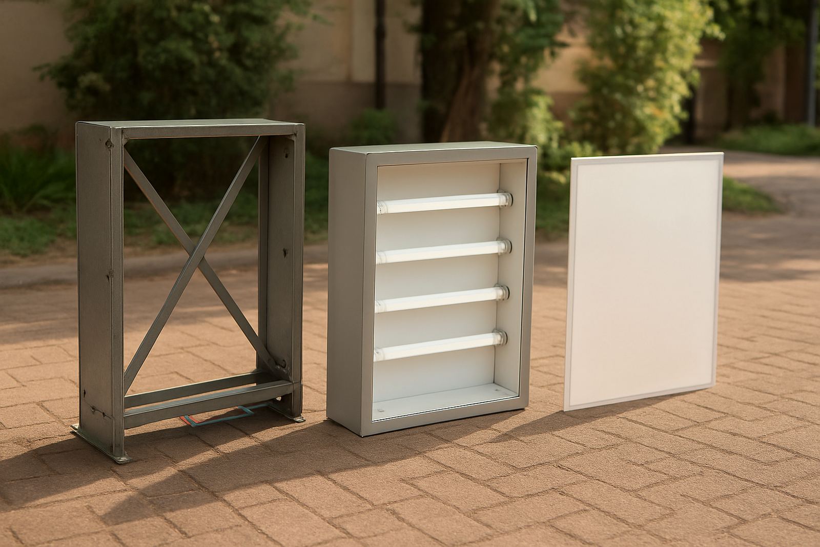
Lighting changes how the sign reads, especially in buildings where reception is dimmer after hours or during load-shedding. The choice usually comes down to face-lit lettering, halo-lit letters, edge-lit panels, or a discreet light box. The right option depends on the look you want and the amount of maintenance the client can support.
For many reception areas, halo lighting gives a neat glow on the wall without making the sign too bright. Face illumination works well when the logo must stand out against a darker background. If the foyer has a reception counter nearby, we keep glare under control so the sign does not fight with screens, task lights or reflective finishes.
- Plan cable routes before the wall is closed or finished
- Confirm where the transformer or driver will be accessed for future servicing
- Use a lighting level that suits the room, not just the sign itself
- Ask how the sign will appear during load-shedding and backup power use
Fixings, backing boards and wall conditions
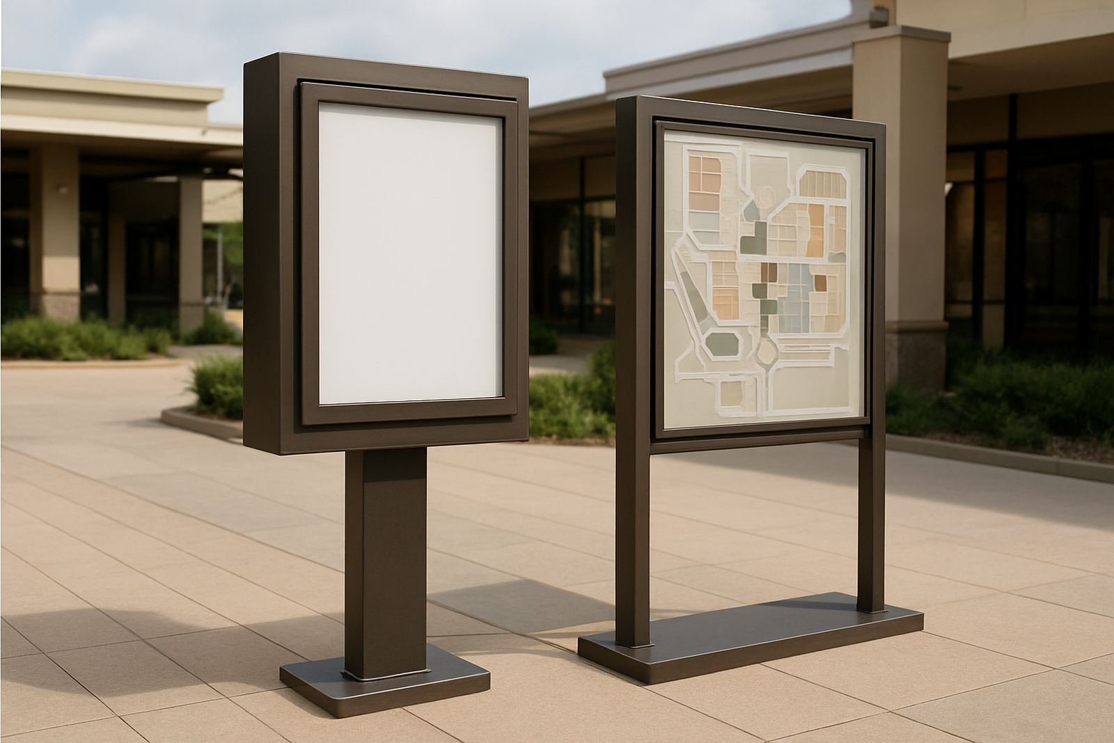
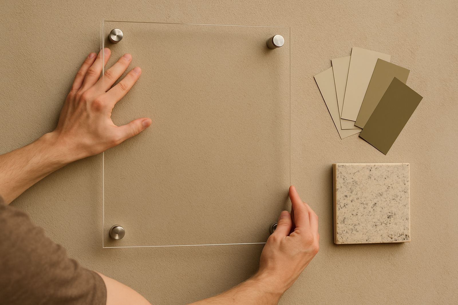
The best-looking reception sign can still fail if the fixings are wrong. We always check whether the wall is brick, dry wall, concrete, cladding or glass, because each one needs a different fixing method. Heavy letters and panels need proper stand-offs, anchors or hidden brackets, while lighter items may be fixed with specialist adhesive and mechanical support.
On painted walls, the finish must be fully cured before installation. On tiled or polished surfaces, we usually recommend a backing board or sub-frame so the sign can be installed cleanly without risking cracks. If the building has movement joints, that detail needs to be handled in the layout and not left until site day.
- Confirm wall type and load bearing capacity
- Use fixings suited to the substrate, not a one-size approach
- Allow for access panels if there is lighting or wiring behind the sign
- Check that the sign is level to the finished floor, not only to the wall edge
How the design should support the brand
A reception sign is usually the first branded surface a visitor sees, so the message must be clear and measured. Too many colours, too much copy, or a crowded layout can make the space feel busy. The cleanest signs use a controlled logo size, good letter spacing and a background that gives the brand enough contrast.
Where the reception area serves multiple tenants or departments, the sign should make the main business name dominant and keep secondary wording smaller. If there is a strict corporate style guide, we work within it, but we also check what will actually read well in the room. A sign that matches the guidelines on paper but looks weak in the foyer is not doing its job.
- Keep the main name dominant and secondary text smaller
- Use contrast that reads in the actual light on site
- Avoid clutter around the logo or wordmark
- Match the sign finish to the reception furniture and wall colour
From approval to handover: a practical checklist
Reception signage should be treated like a small project, not a quick print job. The process usually starts with a site survey, then design development, material specification and structural coordination if the sign is large or illuminated. For commercial buildings, we also check if landlord approval, fire clearance or internal facility sign-off is needed.
Before installation, the team should confirm dimensions, fixing points, power access and final artwork. After fitting, the sign needs a proper handover with notes on cleaning and maintenance. In busy Gauteng offices, that means planning for dust, cleaning staff and occasional wall touch-ups. If the building is near the coast or on a site with heavy air pollution, the cleaning routine should be tighter from the start.
- Approve the final size and artwork before fabrication
- Confirm wall prep and power supply before installation day
- Check the sign from the main entry point and the reception counter
- Set a cleaning and maintenance plan for the first 12 months