
Start with the estate journey, not the first sign
Before any artwork is drawn, map how residents, visitors, delivery trucks and emergency services actually move through the estate. A good signage plan begins at the access gate and follows the full journey: security entrance, main internal roads, visitor parking, clubhouses, offices, residential clusters and exit points. In Modderfontein, Sandton and Midrand estates, that usually means accounting for multiple access points, short stop-and-go routes and clear night visibility.
We usually start with a site survey and a simple movement audit. That shows where people hesitate, where traffic backs up, and where a sign can be missed because of angles, trees or parked vehicles. If the route is not clear on site, even a neat sign can fail. The aim is to reduce questions to security and keep visitors from circling the estate twice.
- Map every arrival route and internal turning point
- Note sightlines from a driver’s seat, not only a pedestrian view
- Check for trees, walls, lighting poles and access booms that block visibility
- Separate visitor, resident and service movement where possible
What belongs at entrances and guardhouses
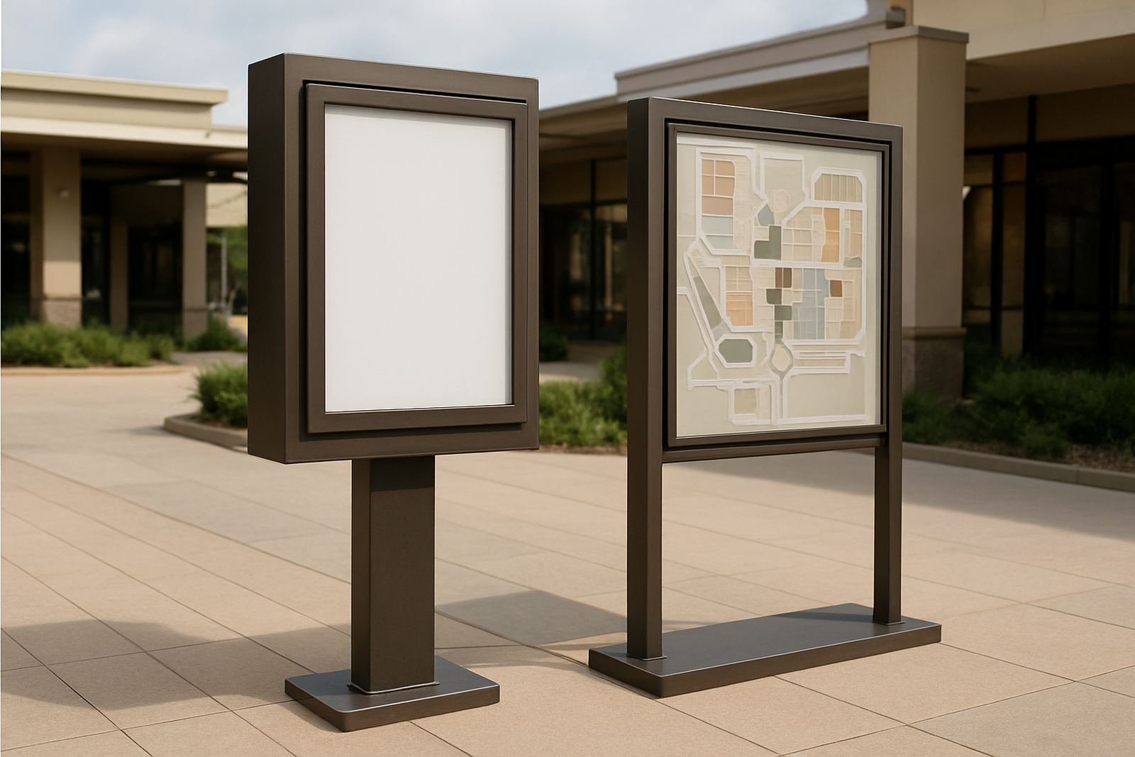
The entrance is the estate’s first instruction point, so it should do more than carry a logo. It must identify the estate, communicate access control and support security staff with clear wording. At busy gates, a large main identity sign, a rules panel and directional markers often work together. For coastal estates near Durban, choose materials and fixings that can handle humidity and salt air. Inland estates still need UV stable prints and finishes that hold up through heat and dust.
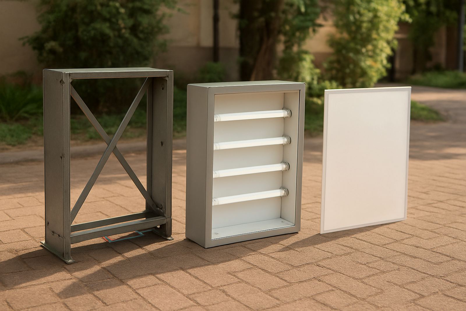
We often specify a combination of aluminium, routed Perspex, vinyl graphics and powder-coated steel depending on the style and maintenance needs. If the estate has night-time access, the entrance should also consider illuminated elements or external lighting aimed at the sign face. During load shedding, reflective elements and well-placed lighting become much more important.
- Main estate name sign at driver eye level or above, depending on speed and setback
- Access rules, office hours and visitor instructions in clear wording
- Security point identification for deliveries, contractors and emergency response
- Lighting or reflective details for after-dark reading
Guide traffic at intersections and decision points
Internal intersections are where estate signage earns its keep. These are the places where people need quick decisions, not long explanations. Directional signs should point to clusters, buildings, amenities and exits before the turn arrives, with enough lead time for drivers to slow down safely. In larger estates across Pretoria, Centurion and Germiston, this often means using a mix of freestanding wayfinding signs, pole-mounted blades and mounted panels on existing structures.
Good intersection signage is consistent. If one sign says Block A and another says East Court, visitors will slow down and second-guess themselves. Keep naming conventions clean and repeat them across maps, entrance panels and directionals. Where speed control is important, signage can also support road markings and speed calming, but it should never clutter the road edge. Less is usually better, as long as the route remains obvious.
- Use the same naming system on every sign and map
- Place directionals before the turn, not after it
- Keep arrows and text large enough to read from a moving vehicle
- Avoid too many messages on one panel
Make amenities easy to find for residents and guests
Amenities should be easy to reach without asking for directions at the gate. Clubhouses, gyms, pools, play areas, meeting rooms and waste collection points all need clear identification. These signs are not only functional, they also shape how people experience the estate. If a visitor cannot find the clubhouse or visitor parking quickly, the estate feels confusing even if the rest of the signage is fine.
For amenity areas, we often recommend a layered approach: one identification sign at the entrance to the area, then smaller directional signs where the route branches. For multi-block developments, number boards or cluster names should be visible from the road edge and from pedestrian paths. In Gauteng estates with strong sun and dust, finishes must be selected with cleaning in mind, because a sign that is difficult to maintain becomes hard to read within months.
- Identify each amenity with a visible, simple name panel
- Repeat directions at path split points and parking entries
- Include pedestrian guidance where residents walk between facilities
- Plan for easy cleaning and replacement of damaged panels
Visitor arrival points need calm, direct instructions
The visitor experience usually fails or succeeds in the first thirty seconds after entry. The arrival point should answer three questions quickly: where to park, where to report, and where to go next. For offices within estates or mixed-use developments, this often means a dedicated visitor sign set, a reception marker and a parking instruction board placed in sequence. If the estate hosts events or contractors, temporary message panels may also be useful.
We pay close attention to vehicle stopping areas, because visitors often slow down in the wrong place when information is unclear. A clean arrival sequence reduces congestion and keeps security flow under control. In practice, that means using short messages, larger type sizes and physical placement that respects how cars actually stop and turn. The sign should guide, not overwhelm.
- Show visitor parking clearly before the first decision point
- Mark reception or sign-in points with plain wording
- Use consistent colours and symbols across the arrival route
- Allow for temporary signage during events or maintenance work
Choose materials, approvals and maintenance with the estate team
Estate signage has to pass more than one test. It should suit the architecture, meet municipal or estate rules where required, and remain serviceable over time. That is why material specification matters. Routered Perspex, aluminium panels, fabricated 3D lettering, brass detail and LED components all have different maintenance needs and visual results. For exposed sites, we also consider wind loading, mounting height and corrosion resistance. On taller signs or pylons, structural coordination is not optional.
Before fabrication, approvals should be checked with the estate manager, body corporate, developer or local authority where applicable. This avoids costly rework and delays. A proper handover should also include a maintenance plan with cleaning intervals, replacement parts and access notes for any electrical items. If the estate is in a high-traffic area or near the coast, review the sign schedule every year rather than waiting for damage to appear.
- Confirm design approvals before fabrication starts
- Match materials to exposure, maintenance budget and brand style
- Check structural requirements for freestanding signs and pylons
- Include cleaning, bulb or screen service and repaint cycles in the handover
A practical checklist before you sign off the project
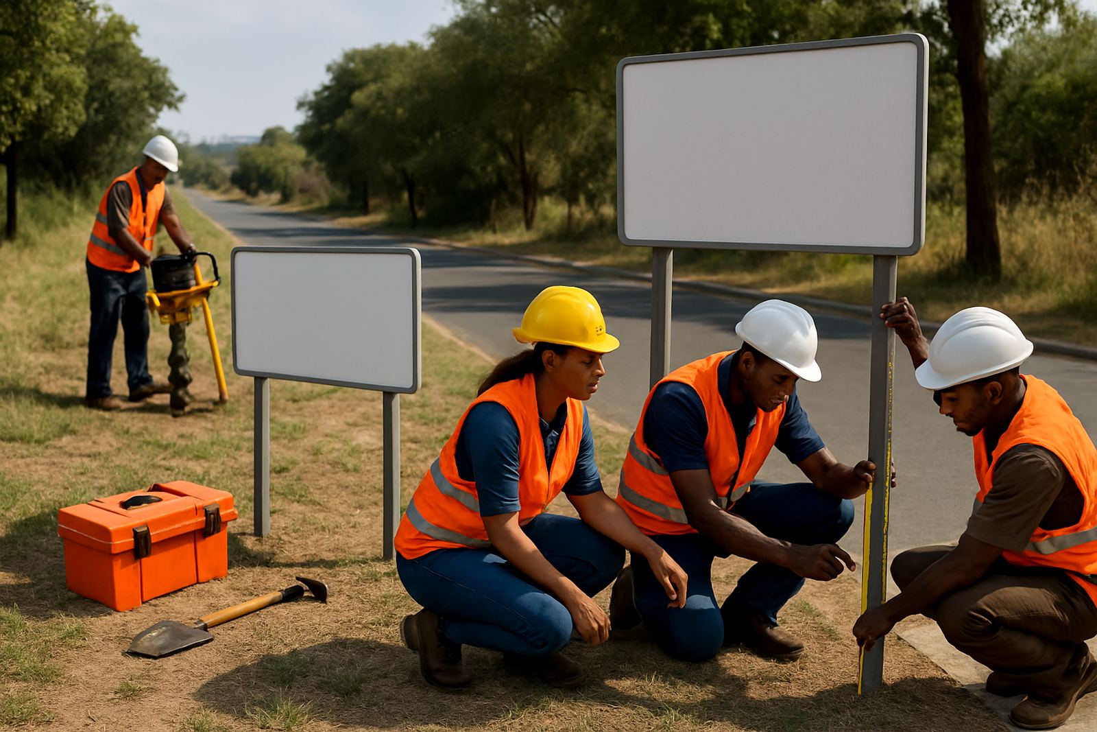
Once the layout is settled, walk the estate again with the final sign schedule. This is the point where small issues are caught, like a direction arrow that points too late or a panel hidden by landscaping. We use this stage to confirm wording, mounting heights, illumination requirements and installation access. If the estate is occupied, staging the work in phases can help avoid disruption to residents and security operations.
A final sign-off should leave no confusion about who moves where, who maintains what, and which signs must be updated if the estate expands. That makes the system easier to manage over time and keeps the estate looking orderly rather than patched together.
- Have all sign locations been checked on site
- Are names, arrows and wording consistent across the full estate
- Have lighting, fixings and structural needs been confirmed
- Is there a maintenance and replacement plan in place